
For the most part, we like to think about architecture in three dimensions; rarely can a design strategy be applied like a 2D object. With that said, we’re always up for challenging our own theories and we’re currently finishing up a project that has pushed our thinking on this front.
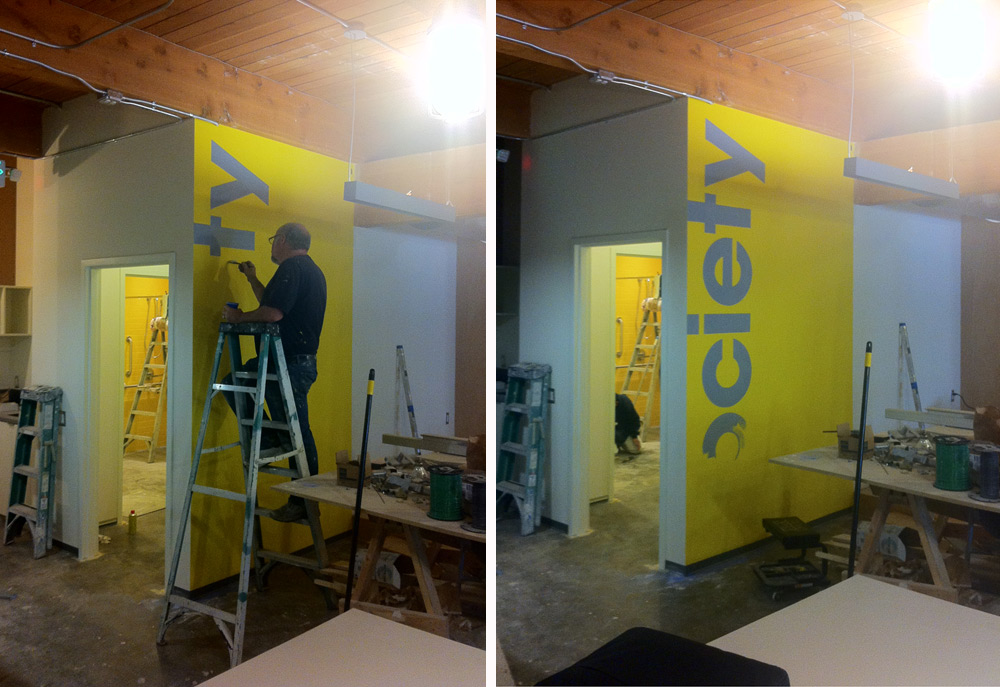
The Society Consulting headquarters is an 11,500 square foot, 2 story space located in Bellevue, Washington; it’s a space for working, recruiting, networking, giving presentations, and being a member of the digital frontier. Inside, the large, simple volumes include expanses of horizontal and vertical surface area. It’s these “blank canvases” on the walls and ceilings that we’ll focus on for today’s post.

While we typically like the look of clean, undisturbed white walls, such a strategy seemed to overlook what could be significant design opportunities for the Society space, or “Society Moments,” as we’ve taken to calling them. We started to think about the walls as real estate to communicate ideas, and that is precisely when our notions about architecture and surface treatments began to challenge one another. We began to envision these blank canvases as communicators and we focused our efforts on what sort of messages they could convey to visitors and staff. Subsequently, the project pushed us to develop an additional kit-of-parts that you may be seeing more of in the future. Here’s a behind the scenes breakdown along with process photos (stay tuned for the finished shots):
1. Unfolding Tangram
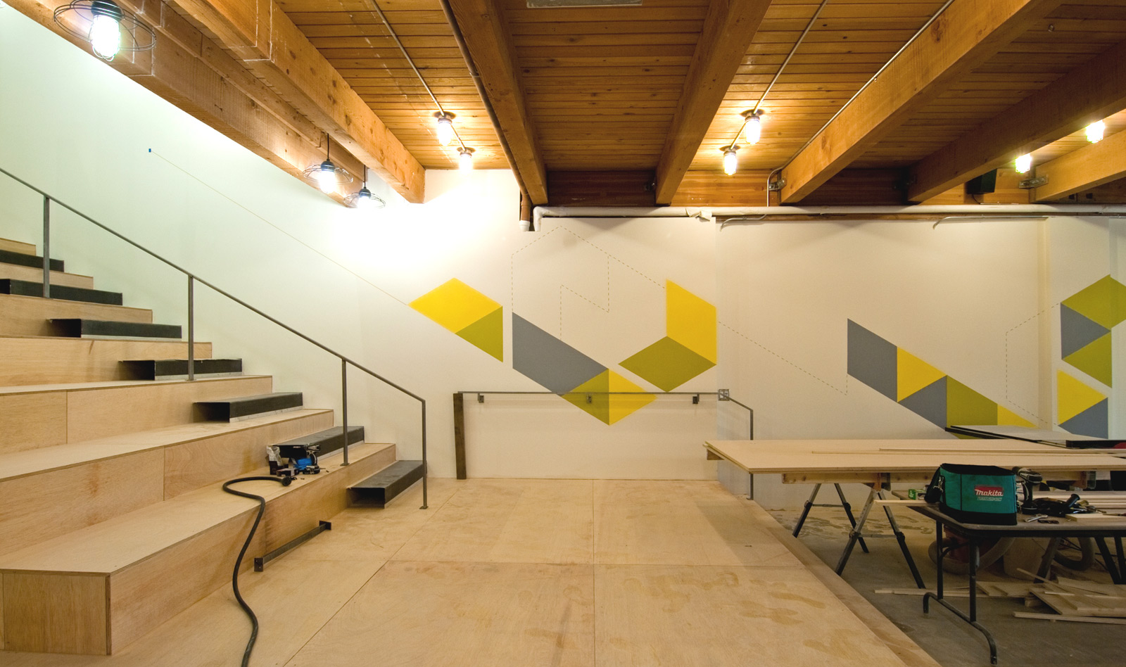
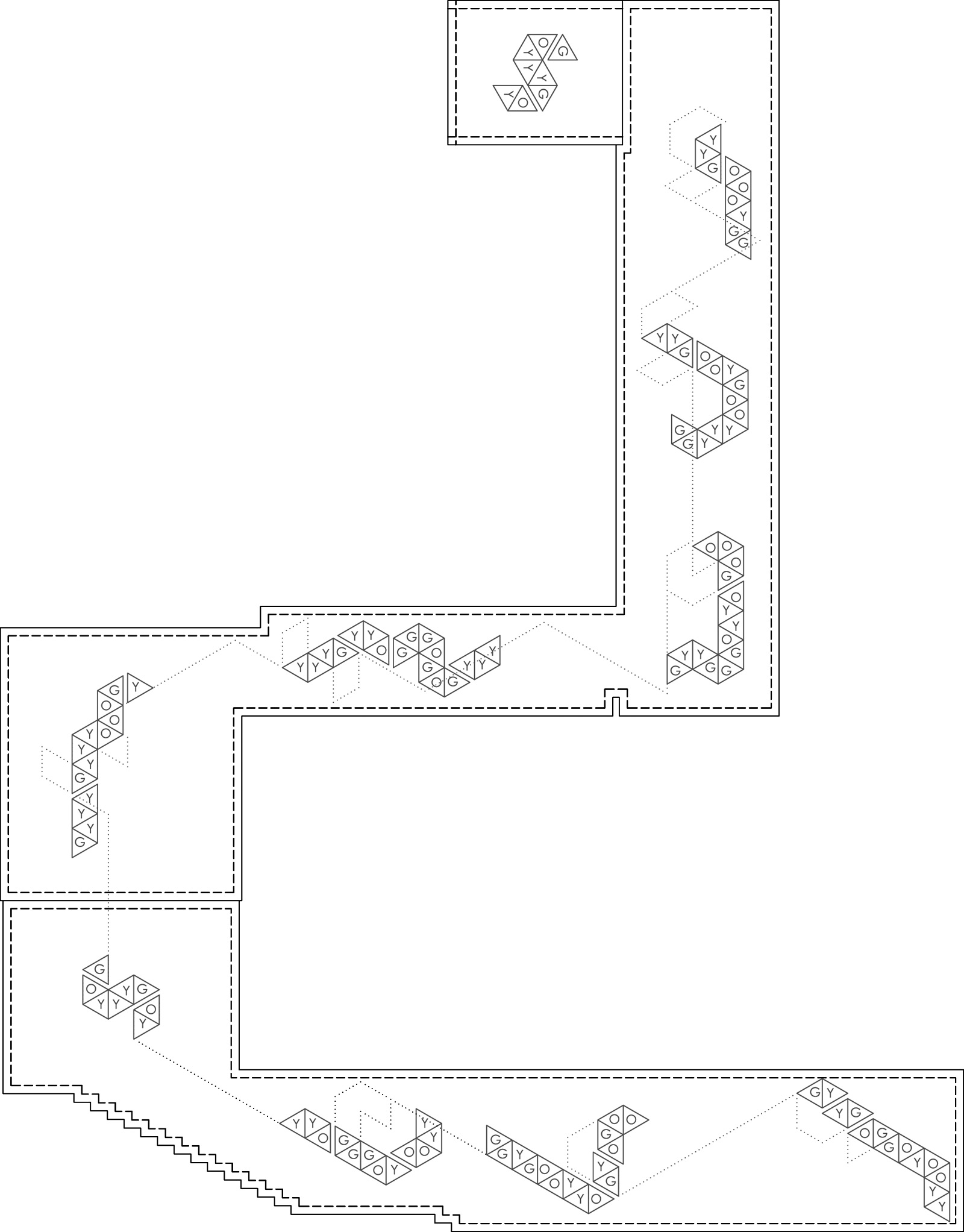
The Society Consulting logo is a clever tangram arrangement: a geometry based on an ancient Chinese dissection puzzle consisting of seven flat shapes, called tans, which are put together to form complex shapes and patterns. The more we studied up on tangrams, the more fascinating the Society logo became. The folding process to arrive at the Society logo was such a curious sequence of geometrical moves, in fact, that it seemed a shame to display the tangram in only one of its many possible variations. In the completed space, the primary tangram logo will greet visitors at the entry reception, then it unfolds and extrapolates down the hall, up onto the ceiling, down the stairs, across the main wall of the downstairs workspace, and finally terminates near the original entry point at the floor above. The intent of the design move is to graphically communicate the language and logic of the tangram, all the while giving people thought-provoking graphics that link the upstairs with the downstairs. The wall murals are being painted by the very talented David Heck.

2. Editable Wall Clock
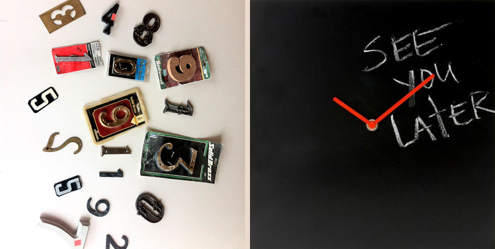
Society is a dynamic place with social events, impromptu gatherings, informal meetings, and plenty of getting things done in between. The idea of a large wall clock seemed appropriate as work in the digital information age is often calibrated down to the minute. But for this space in particular, it seemed only appropriate to design in some fun. We came up with an interactive wall clock that could accommodate Friday happy hours, an important presentation or the Seattle Sounder’s game time. The large scale clock hands are attached to a chalk-board wall which can accommodate additions, modifications or comments to the day’s schedule. The clock is outfitted with an assortment of laid-back numbers from 1 to 12.
3. Dynamic World Map
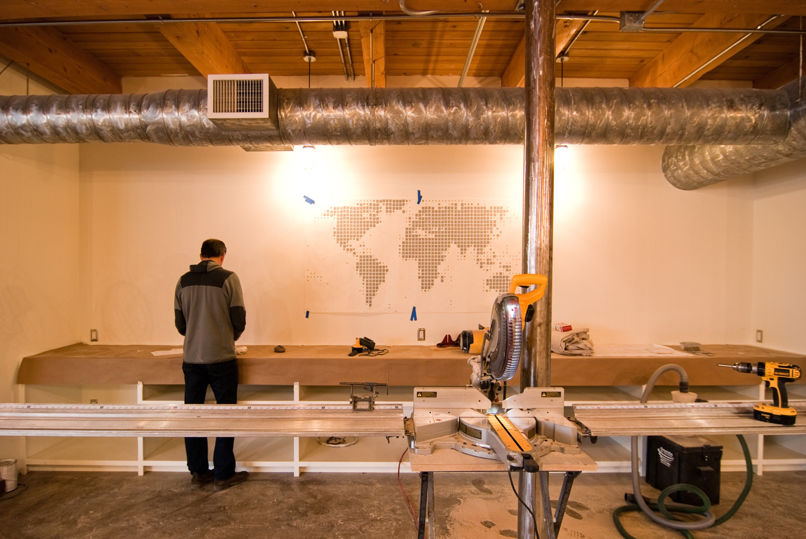
The staff at Society is made up of interesting people from all over the place — the kind of people who have a good stories to tell about where they’re from and where they’ve been. A large wall above the office storage cabinets was selected to tell these stories. The large world map decal centered in the space allows for Polaroid shots of the partners and staff to link to their respective places of origin on the map. It’s an interactive map wall that introduces new team members and allows people to find out more about one another. It’s also a diagrammatic means to display the diversity found at Society. The world map decal is from K&L Wall Art and the Polaroids are the product of this slick little camera.
4. Field of Mugs
A small kitchenette area takes advantage of the items it needs to house. When it comes to stored items, our philosophy is to either hide it or make it beautiful. With this situation, we chose to make the accumulation of coffee cups something visually cool. A perfect grid of stainless steel brackets extends all the way to the ceiling. In so doing, the daily movement and storage of coffee cups becomes a visual wall graphic. Wall mount brackets are by Sugatsune.

5. Necessities as Ornament
Because of the pre-existing geometry of the building, the bathrooms are snuggly fit into the space. They’re great bathrooms and are up to accessibility standards, but by the time all the handrails are installed and the proper clearances are met, storage space is severely limited. At the same time, commercial bathrooms go through a lot of paper products. So that supplies are close at hand, the storage of toilet paper was moved to the hallway where a wall of shelves, perfectly dimensioned to hold rows of t.p., becomes a feature unto itself. Bonus points for pixilated art with colored t.p.

6. Wall Decals
In the back of the space there are a series of four small private phone booth rooms. This is where you can call your mother to tell her how much you love her or let your previous employer know that you’ve seen the light of Society and you’re never coming back. Whatever the case, the rooms offer a practical environment to conduct phone calls in private. Each room receives a telephone wall decal to both signify the place and make a tongue-in-cheek gesture about the wireless nature of the modern day telephone.

7. Wall Paper
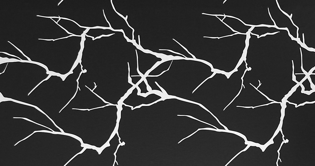
Back near the kitchenette, under a bank of wall cubbies is an application of tree branch-inspired wall paper. We could probably post-rationalize all day long about why tree branch decals are the appropriate thing to do here. But really, it just looks nice. The branches and telephone pole decals are from 2Modern.
Adjacent to the phone booths is a dead-end hallway that was screaming for something cool. This little nook is a quiet spot in an otherwise bustling space and we took the opportunity to designate it as “The Library.” Floor-to-ceiling bookcase wallpaper accompanies a cool chair, side table, and lamp. Have a seat, hang out for a while, grab a book (or rather, download a book to your iPad). Bookshelf wallpaper by Wall Paper Direct.

That’s the inside scoop on Society, stay tuned for much more on this project and cheers from Team BUILD.


