
[Image credit: John Szot]
As architects and builders who are effective with time and resources, we’re constantly looking for ways to evolve the graphic language of our deliverables. Throughout the design process, our goal is to produce a graphic language that does five things successfully:
1. It assists us to develop ideas and make sensible decisions.
2. It documents our exploration of design and our thought path.
3. It clearly communicates to the widest possible audience.
4. It enrolls people in the power of good design and the solutions we’ve developed.
5. it saves time and doesn’t require us to spend a gazillion hours in complicated rendering programs.
With these drivers in mind, we’re always on the lookout for designers and groups who are hitting that magic balance between 1-4 and 5. Today’s post highlights several architects, designers, and thinkers who are doing a remarkable job developing a graphic language. Through their graphic techniques, opportunities and insights emerge that wouldn’t be conveyed via words or traditional drawing methods. At the same time, the languages they have developed are not overly complicated and esoteric. There is a tremendous amount to learn from these examples and we’ll let the graphics do the talking.
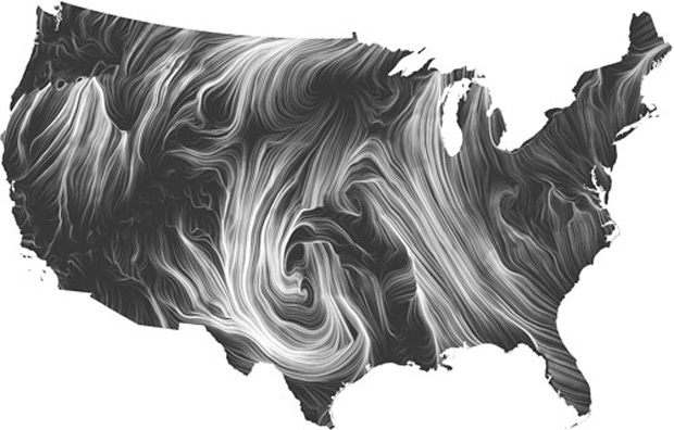
HINT.FM is a great departure point on diagramming. The collaboration of Fernanda Viégas and Martin Wattenberg invents new ways for people to think and talk about data. Their celebrated Wind Map below is a fantastic example of lucidity of their graphic language. Their website is worth a deep dive.
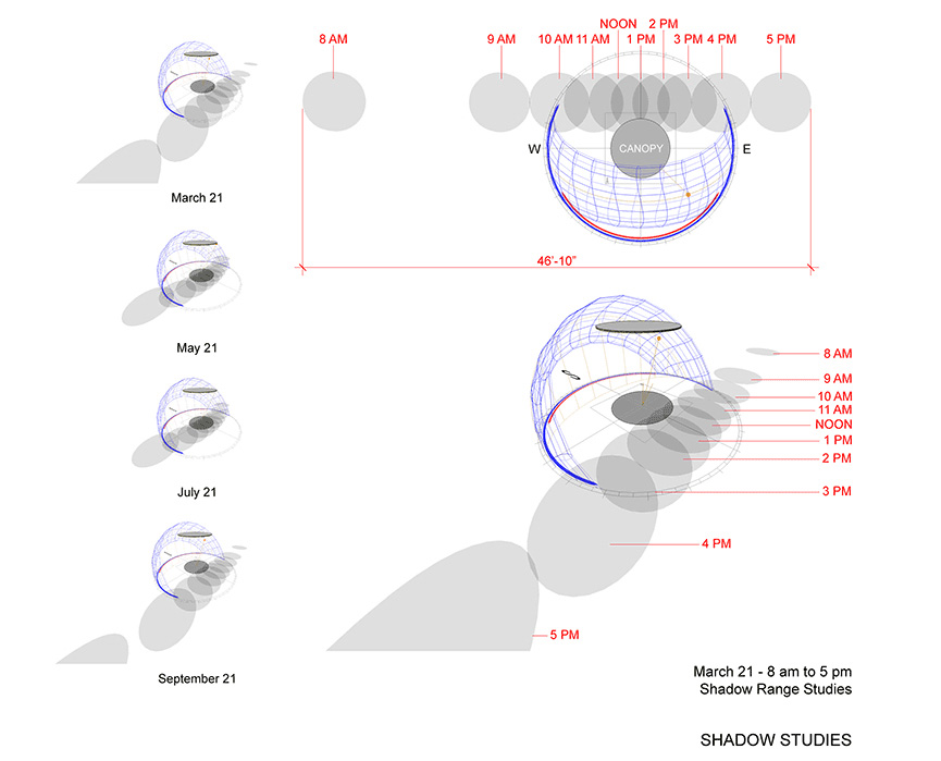
Technical and precise, the graphic language of Lorcan O’Herlihy is at the same time sensuous and easy to absorb. The diagrams communicate clear relationships between objects and the environment, while color and shade are used judiciously.




The diagrams of Ryan Allord are infectious; the simple geometrical relationships please the mind and lead the observer down the path of rational, data-driven design conclusions. Once again, color is used carefully to give key components of the language a subtle hierarchy.

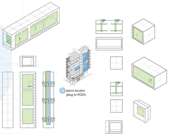

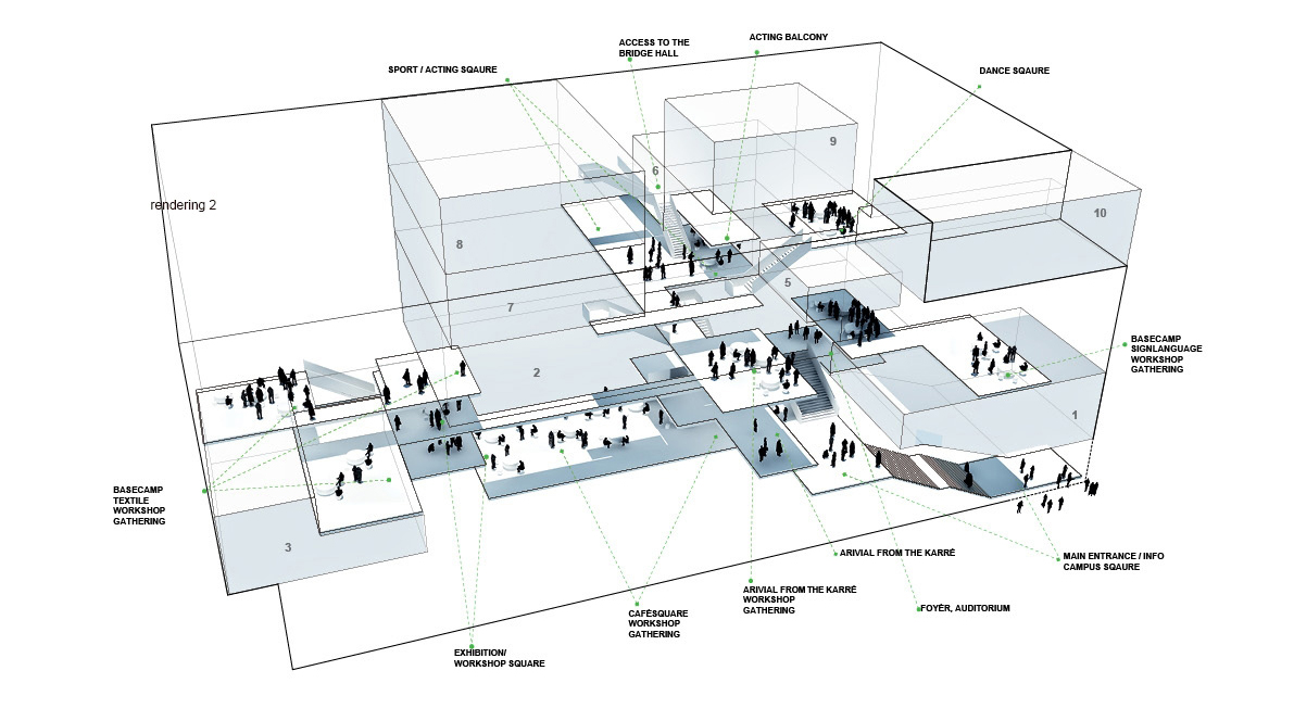
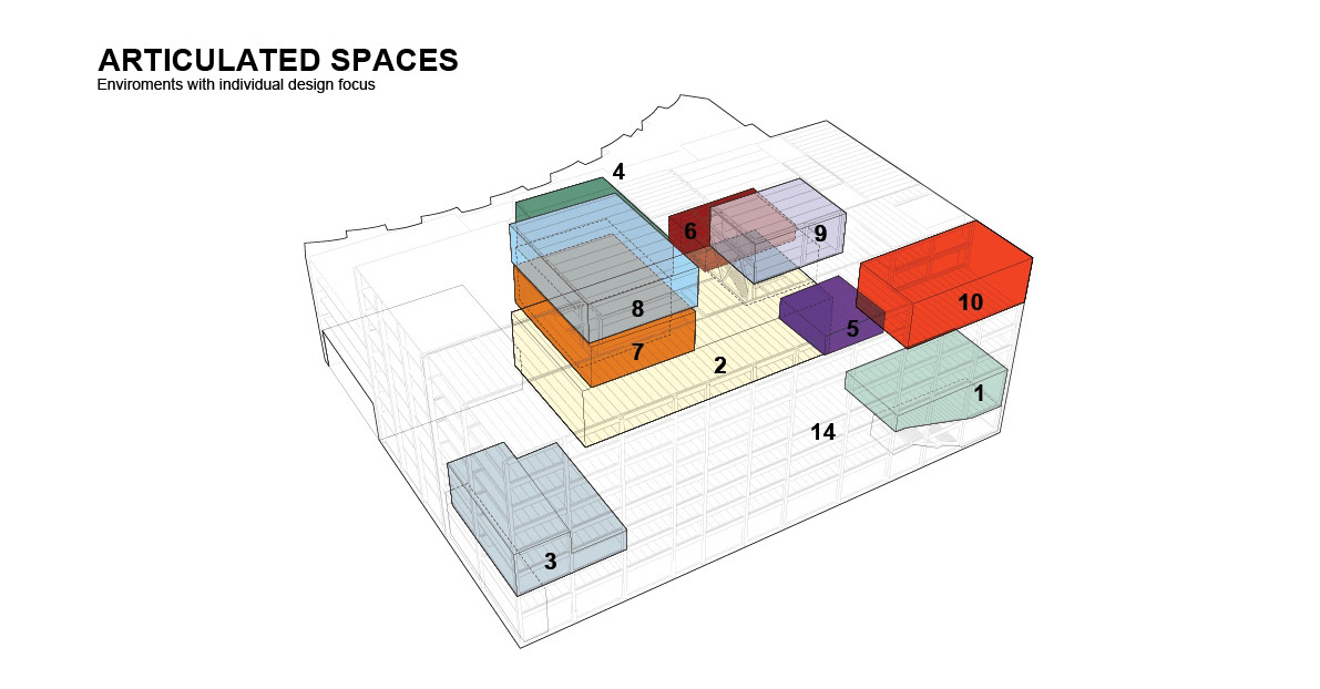
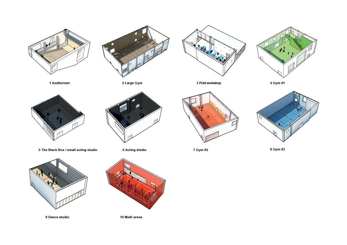
NORD Architecture has created a dynamic graphic language that is also approachable and playful. Breaking out of the architect’s tool box of gray shades, multiple colors are employed without overwhelming the viewer.

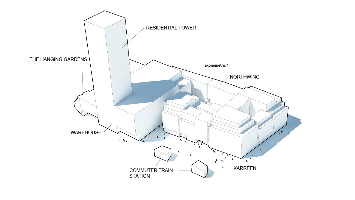
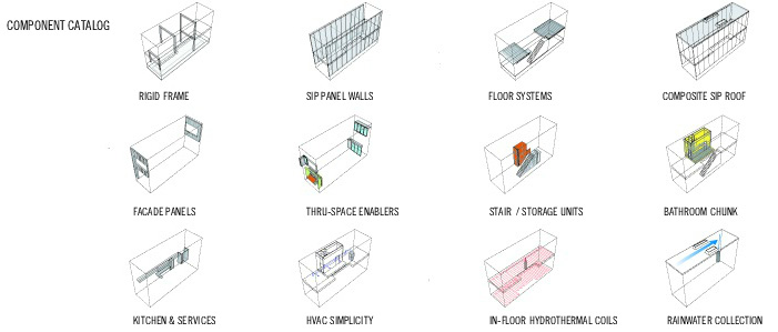
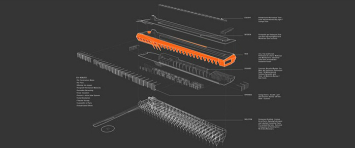
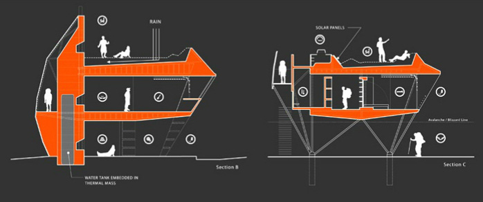
 Scientific and rational, the diagrams of KBAS speak to the mechanics of their architecture proposals. A simple palette of white line weights on dark backgrounds are enhanced with the deliberate use of orange. The result is stimulating and informative.




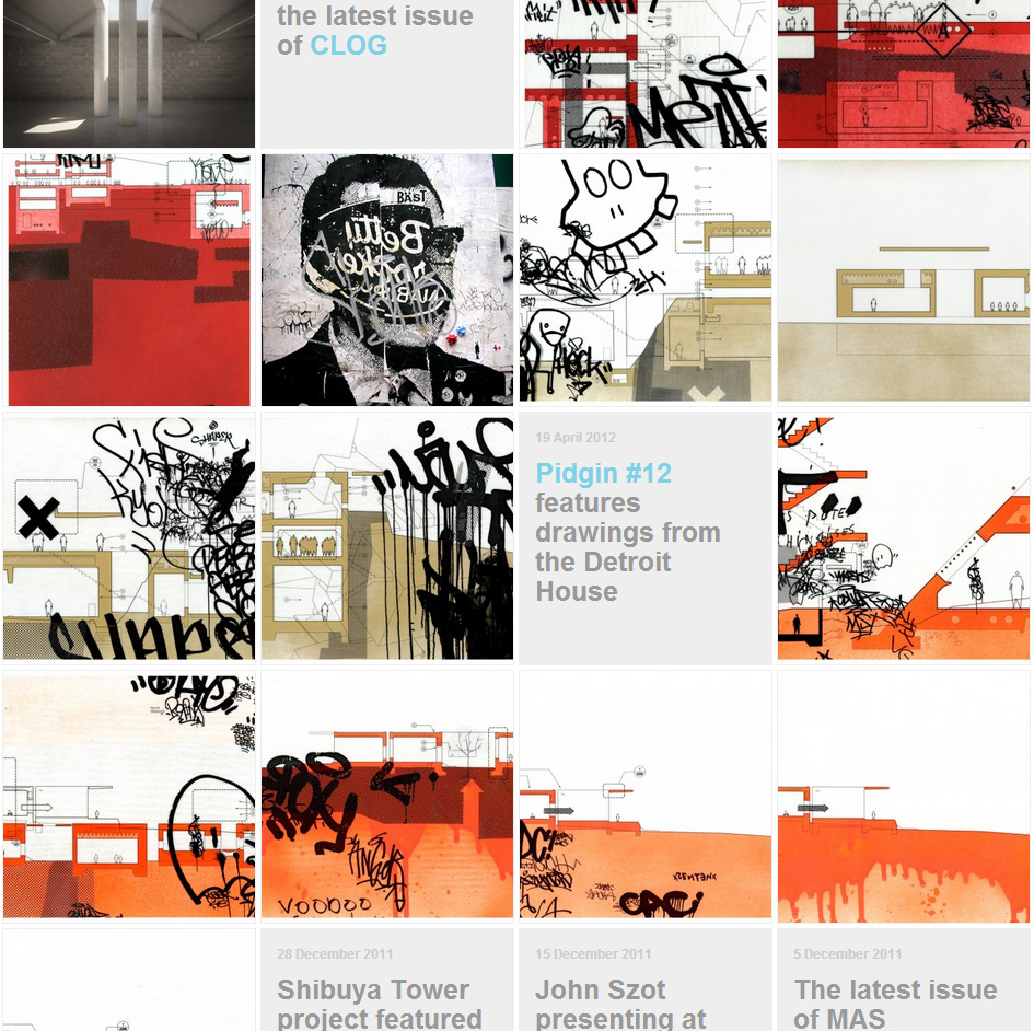
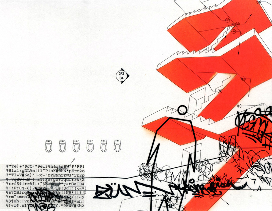
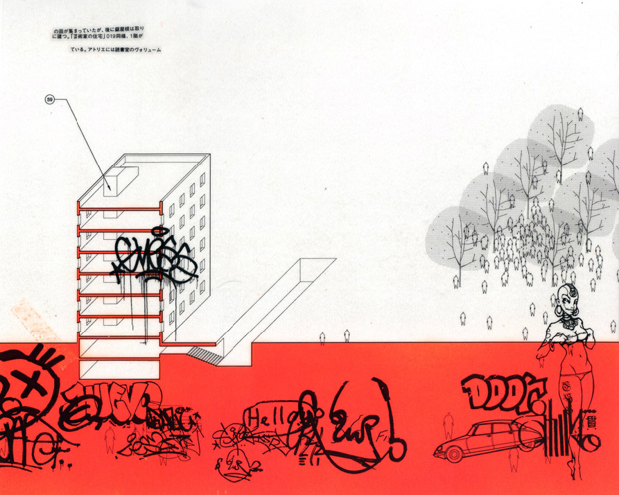
It’s rare to find a diagrammatic language that is at once technical and gritty, but the work coming out of John Szot Studio accomplishes both synergistically. The introduction of superimposed street graffiti activates the image.

We recently got a new book in our hands that knocked our socks off. Le Corbusier Redrawn, The Houses by Steven Park absolutely nails a graphic language of simple, elegant architectural rendering. The book is filled with page after page of three-dimensional digital renderings that actually speak to a timeless craft of draftsmanship. Subtle coloring at glazing and shadow lines at relief allow the drawing to pop off the page. The text establishes a graphic language that is everything it needs to be and nothing more. This is our new favorite book and we highly recommend picking up a copy at your local community bookstore.


That covers our shortlist at the moment. Let us know if there are any out there we missed in the comments.
Cheers from Team BUILD


