
[All photos by BUILD LLC]
We’re currently deep in the trenches, working through the logistics and schematic design of a mixed-use, multifamily apartment building. The project is considerably bigger than the mixed-use projects that we’ve designed in the past; not only is this a welcome challenge and a great education, but it’s causing us to re-examine the built-environment with a higher level of scrutiny.
The project involves a careful balance between design, efficiency, build-ability and cost-effectiveness. Each architectural move requires consideration of things like floor area ratios and rentable area efficiencies. It’s a delicate dance, and one that too many developments in Seattle get wrong. Unfortunately, there are just a lot of bad examples in town. You know the ones, you probably pass a number of them on your way to work every day: the beige, Dryvit clad, faux-traditional, slapped together, cookie-cutter buildings that are so poorly constructed, they may as well be disposable.
Some good examples are out there, though. And as part of our homework, we’ve tracked down a few exemplary buildings. As it turns out, many of our favorites point to the same source: the hardworking architects over at Weinstein A|U are masters of modern urban housing (among other building types, like libraries and fire stations). For today’s post we’ve selected two Weinstein designs that demonstrate simplicity and elegance, despite the overwhelming complexity behind each project (like the International Building Code, Seattle Municipal Code, site constraints, budgetary factors, etc). In our opinion, these are exceptional buildings when you consider the whole picture.
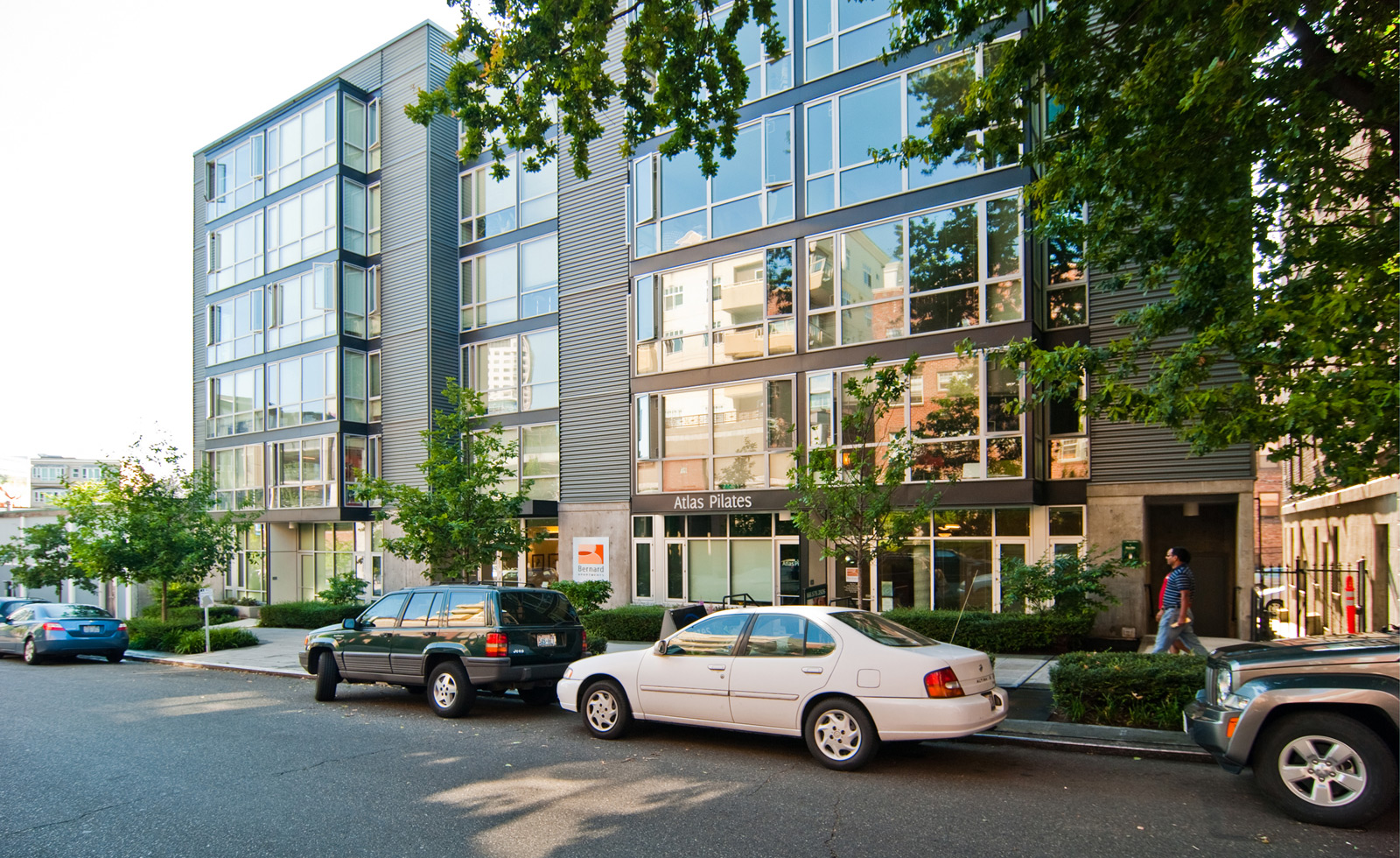
While we could pick apart the technicalities of these projects for days, it’s the poetics of each built work that makes it masterful. Designing a graceful building is one thing, getting it built on a strict budget is entirely another. One of these buildings is an apartment building, the other a Senior Services Center. And while we don’t have information about the finances of either, it’s safe to assume that both have stringent budgets. Of particular importance is that each building uses its cost-effective nature to empower the architecture and bring out the poetry. Here’s our Top Five cost-effective strategies for urban design poetics.

Elegant symmetry. Whatever happened to symmetry? Why did something so elementary to design go out of style? So many contemporary designs try too hard to create irregularity and disharmony that, in the end, most of them just look lop-sided and childish. The Bernard Apartments in Seattle’s Lower Queen Anne neighborhood maintains a simple and pleasing symmetry that serves the logistics of the building and compliments the neighborhood.
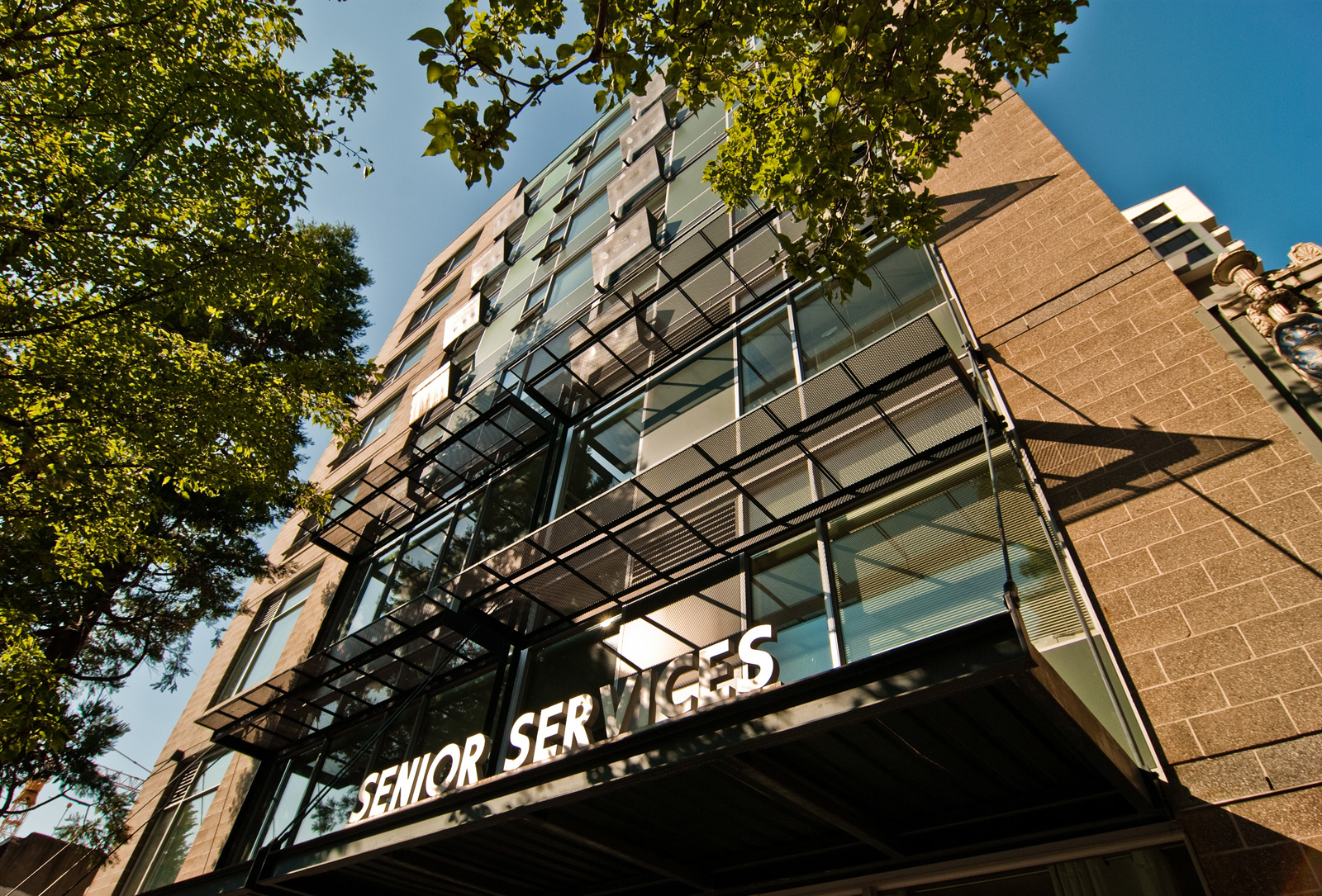
Belltown’s Senior Services Building uses CMU block walls on each side to book-end the composition.

Simple expression of function. The function of a building has a logic all its own, and a sensible, cost-effective design uses that logic as part of the aesthetic code. The Bernard Apartments differentiate the commercial base from the residences above by using a different (but complimentary) visual language for each. These languages are a direct extension of the functions occurring inside. A solid concrete base accommodates the ground floor commercial spaces and provides privacy, durability, and security. The transparent bays above provide natural light and local views to the residential units.

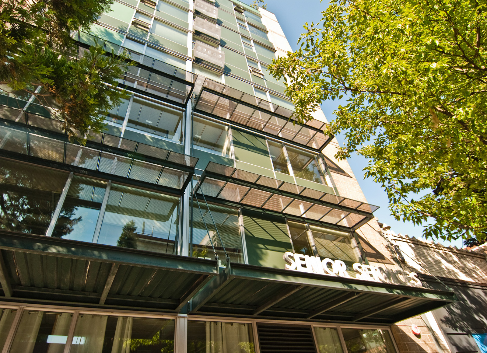
An opposite (but equally successful) relationship occurs with the Senior Services Building. The glass and aluminum storefront offers a welcoming transparency, while the spandrel panels of the window system above offer privacy and shade from the direct sun exposure.
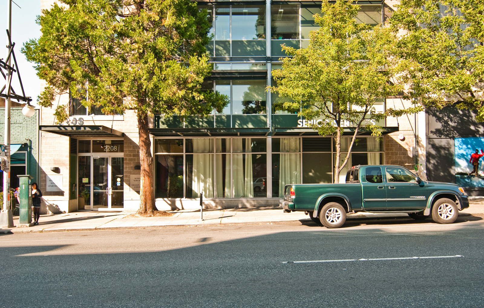
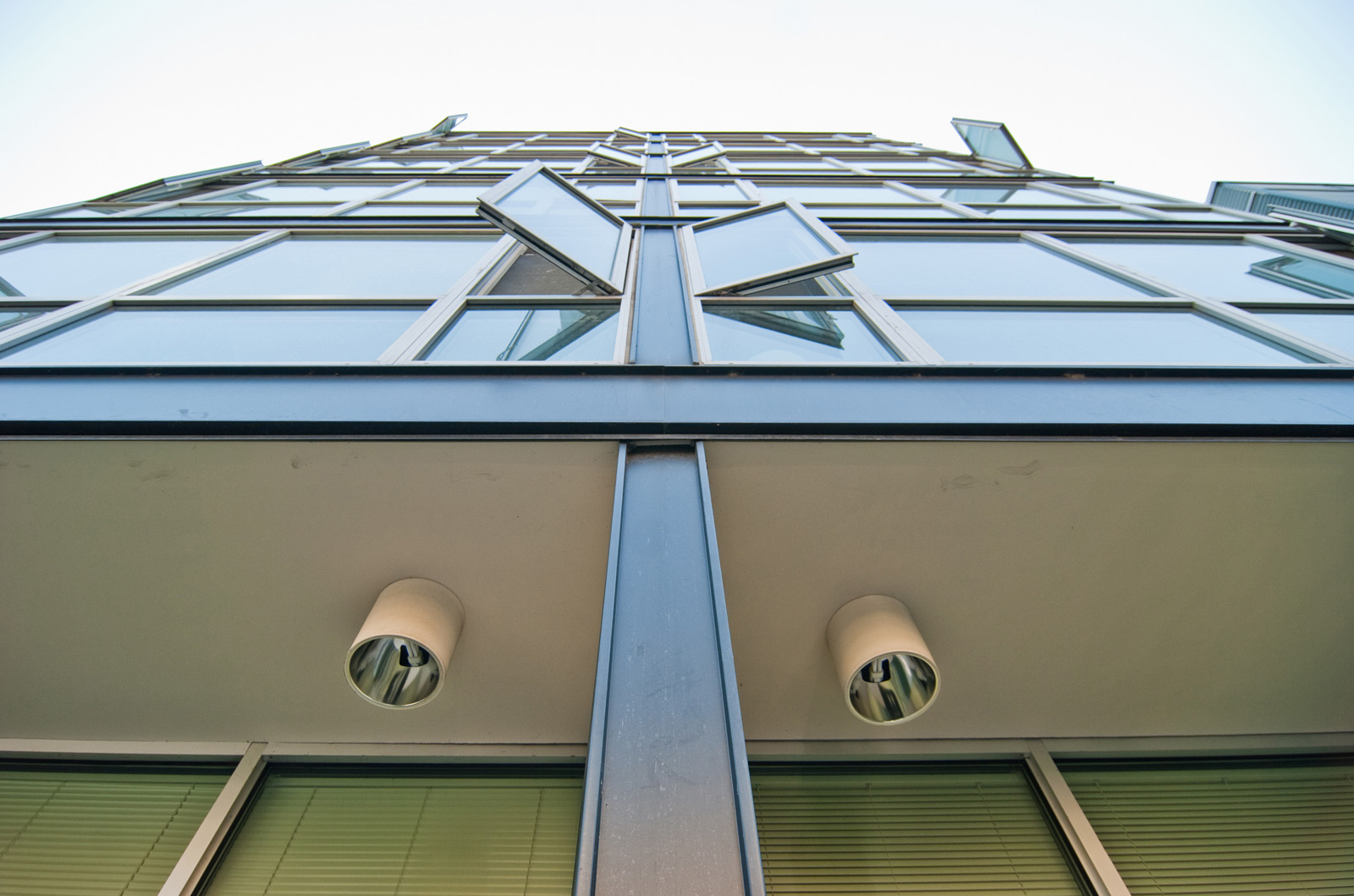
Clear definition. There’s nothing wrong with big, dull boxes, so long as they are articulated properly. Both the Bernard Apartments and the Senior Services Building use a common strategy at the envelope. The horizontal and vertical lines of window mullions and material transitions are a clear and direct translation of the building’s structure. Horizontal floor plans and vertical partitions register at the skin as geometric patterns and attenuation (sometimes we even call this modern ornament).
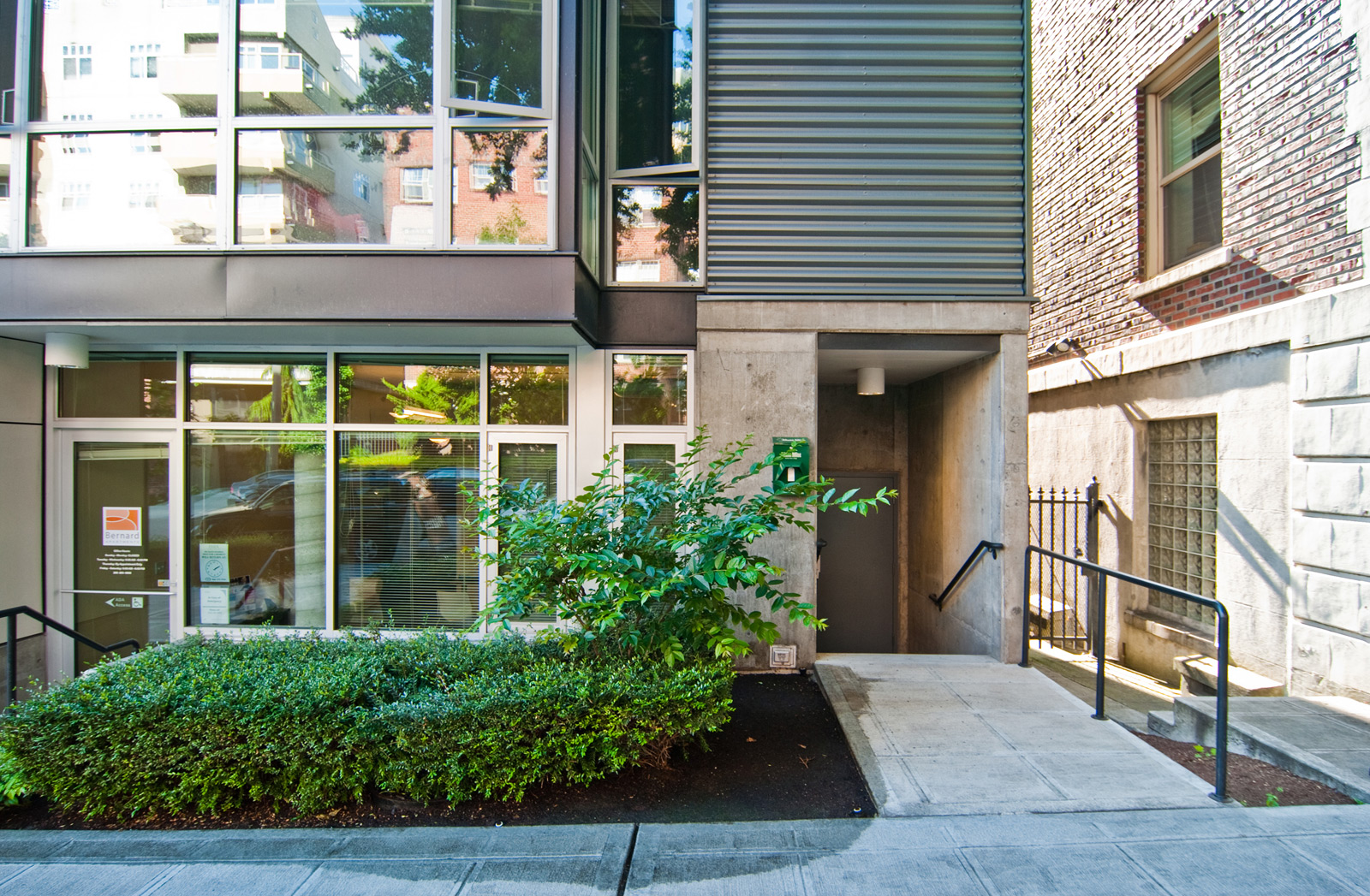
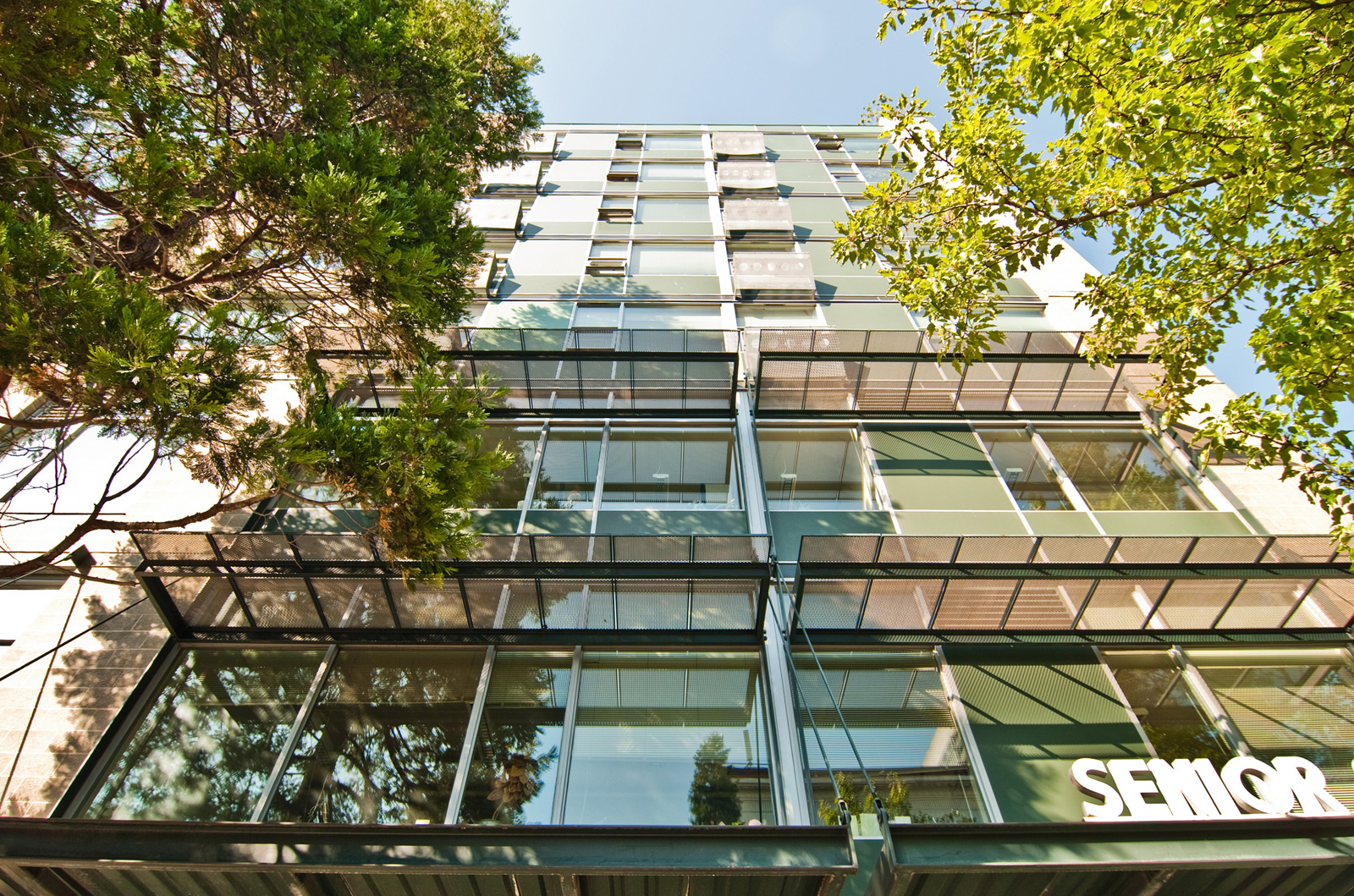
Pure honesty. Buildings should be buildings. They should be unapologetic and authentic to their nature; they should be built with methods and materials of the current time. We like the Bernard Apartments and the Senior Services Buildings precisely for these reasons. They don’t pull silly tricks to reference historic architectures, they don’t try to inauthentically “fit in” with their traditional neighbors. These structures behave like modern buildings for living. They are unassuming; they aren’t pretending to be little houses or something from another era.

Providing necessities. People need natural light, fresh air and a connection to community. These are the fundamental elements of a good lifestyle; they are more important than a breathtaking view or more square footage. The Bernard Apartments and the Senior Services Building do an exceptional job incorporating these fundamental lifestyle qualities into the finished product.
Those are five items that stood out to us. There are most likely many more, so feel free to add yours to the comments section below. We’ll be working to incorporate these ideas into our current project list. A huge thanks to the team at Weinstein A|U for leading the way and providing some very inspiring examples in the built environment.
Cheers from Team BUILD


