Notice anything different about the BUILD Blog today? Hint: It’s not our new shoes. Our unusually chipper attitude, perhaps? Go fish. A new font maybe? Wrong again. Nope, none of the above. The exciting news is: We got ourselves a fancy new interface! Woohoo!
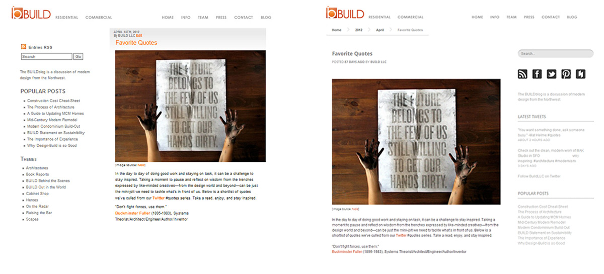
Thanks to the knowledgeable team over at Radiant Story, we redesigned the BUILD Blog with a masonry format emphasizing the image yet retaining all that good content. We made the switch to this format for several reasons:
1. The importance of the image. As interactions online are becoming increasingly more visually-oriented, high-quality photography and images are a must. Not only are these pictures worth a thousand words, but good ones travel fast and far.
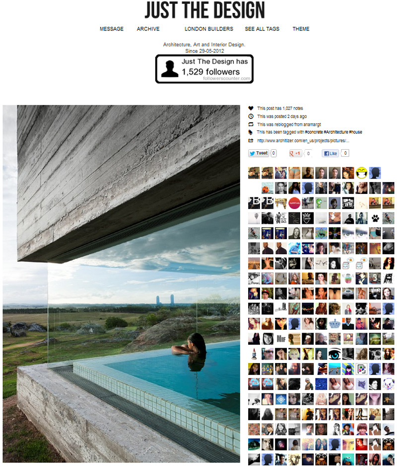
[Image source: Just The Design]
2. The format allows viewers to see more posts at once. The tiled layout encourages readers to poke around a bit and visit posts they may not have stumbled upon otherwise.
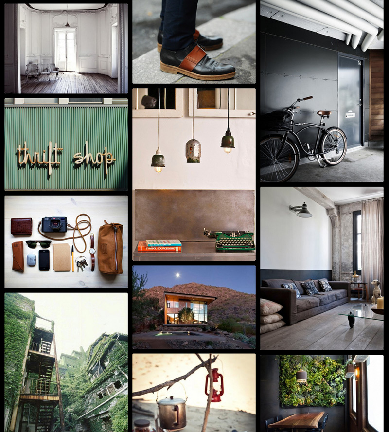
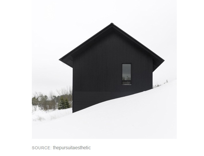
[Image source: The Black Workshop]
3. It accommodates a wider range of devices. The tiles expand with wide-screen monitors and collapse with the compact screen of an iPhone, all while maintaining a sleek, clean layout.
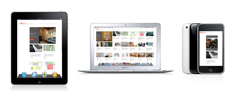
4. Featured Post Section. A box on the top left corner now highlights more of our favorites, with visuals to match.
5. It’s more dynamic. We spend a tremendous amount of time working on the blog and it’s engaging to have a fresh design to work with, and continue evolving our identity.
Here’s a quick rundown on a few additions to the new site:
+ The prominent box in the corner of the main page scrolls through each of our Featured Posts.
+ Just to its right will always be the most recent post.
+ Tiles are chronologically ordered from left to right and top to bottom.
+ A direct link to The Modern List now hangs out in the right corner of the blog.
+ Our latest tweets will now appear in the right margin of each post.
We owe a huge thanks to several websites out there that have provided design inspiration. These sites are are leading the way in digital interface, usability, and forwarding the mission of modern design:
Materialicious for the consistently well-curated catalog.
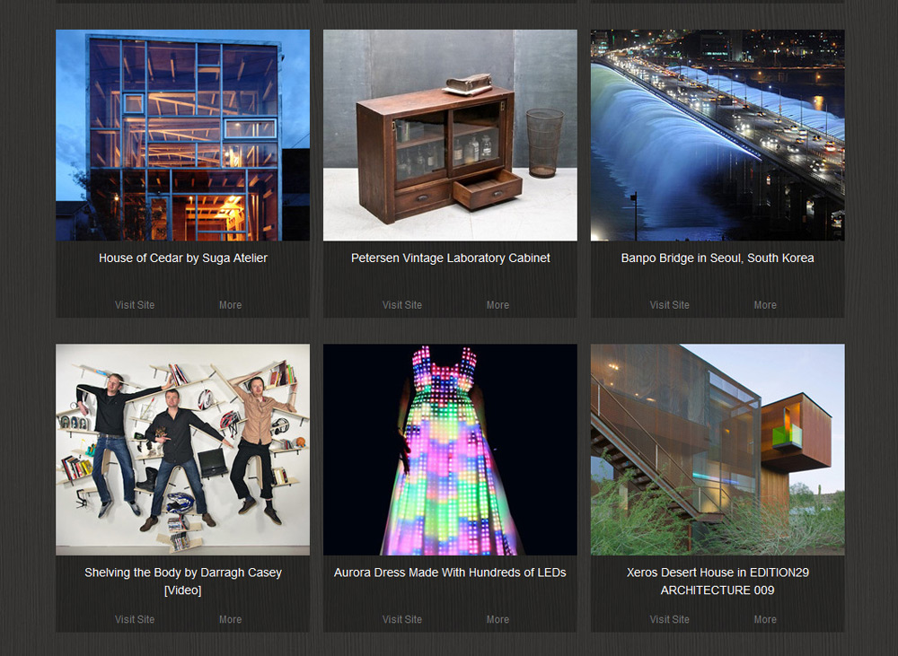
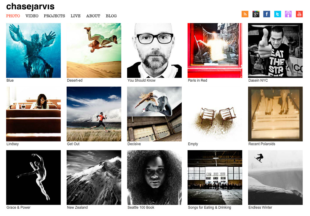
Chase Jarvis Photography for their sharp, attention-grabbing images.
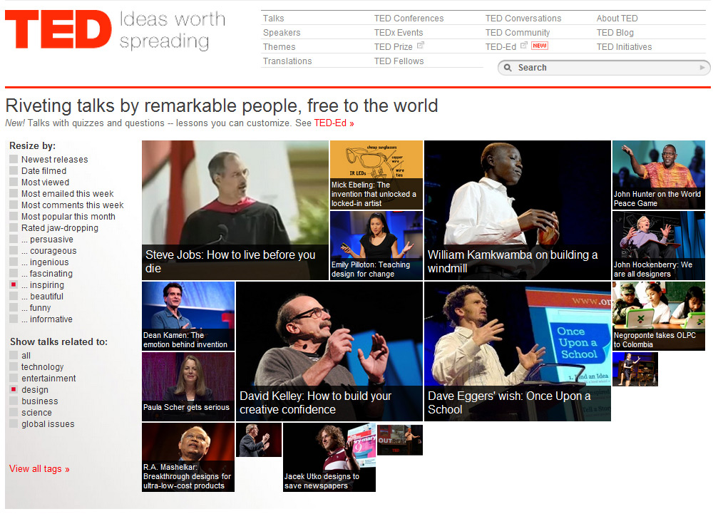
TED for the fresh approach to sharing, teaching, and engagement.
Tumblr for its limitless supply of design fodder.
So, go ahead, poke around a bit. We hope you enjoy the new format, and let us know what you think in the comments section below.
Cheers from Team BUILD
(Note: we’ve been having some issues with our Feedburner lately and some of you may have inadvertently fallen off the syndication. Our fault entirely, and apologies all around. If you’re not getting the BUILDblog delivered to your inbox, your Google reader account, or however you like to receive it, please hit the RSS button (in the upper right hand corner) and log your email into the box. We’re always honored to have you on board.)
