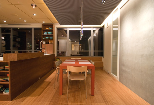
Team BUILD is currently designing up an interior drop soffit on a residential project and, in working through the design, we’ve accumulated a healthy amount of data on the subject. Doing our research, we also noticed that there isn’t much info up on the web specific to interior architectural soffits. Basically the situation met all the criteria for a blog post, so here goes.
What is an interior drop soffit?
It’s a lowered portion of the ceiling in room; it can be structural or purely cosmetic.
What are the reasons for designing interior drop soffits into a room?
Defining space. The soffit’s material or geometry can define a space or function within a room. For instance a soffit in a dining room can define the area of seating or the dining room table. It can create a room within a room.
Making space intimate. Dropping the ceiling level a bit allows for a cozier space. For instance, a lower ceiling at sitting areas creates a more appropriate scale for the space. A lower ceiling can also help enhance taller adjacent spaces.
Material changes. Soffits provide an appropriate place for a material change. The change of ceiling plane made by a soffit creates an opportunity to use a warmer, more special material in contrast to the more ordinary material used at the main ceiling (typically gypsum wall board).
Designating systems. The soffit can be an intentional location for ceiling penetrations like lights, fire sprinklers, smoke alarms, vents, etc. Collecting one or several of these systems and geometrically arranging them within the soffit can look deliberate, allowing the systems to look like they belong there.
Uplights. Soffits can be a good place to conceal lights that reflect off the ceiling and provide a glowing affect in a room. Depending on the circumstance, it may also be an opportunity to provide a different color or quality of lighting.
Screening. Soffits can provide an aesthetically pleasing screen to conceal elements like structure, ducting, hatches, unattractive ceiling planes, etc.
Acoustics. The right materials used in conjunction with one another at a soffit can greatly improve the acoustics of a space.
There’s probably even more tasks that interior drop soffits can accomplish than we’ve listed here. Add ‘em if you’ve got ‘em.
Case studies – some projects of ours
Innis Arden Mid-Century Modern Remodel
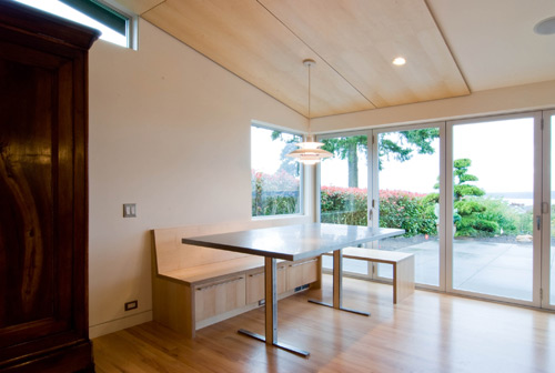
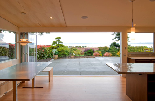
This application keeps the soffit simple and straight-forward. Four sheets of maple plywood are furred down 1.5” from the GWB ceiling to offer visual warmth and to define the breakfast nook below. As far as soffits go, this one is a particularly shallow surface application due to the already lower ceilings of this mid-century modern home; we didn’t want to lose additional ceiling height.

Seattle Penthouse
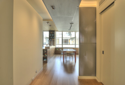
Two separate soffits overlap in this application that accomplishes the entire list noted above. The Alpro corrugated perforated soffit leads people in from the entry, defines the dining area, organizes the systems (lighting, fire sprinklers, and speakers), provides uplighting, makes the dining area more intimate, improves the acoustics with 2” of insulation panels, and last but not least, it screens a ceiling hatch above.
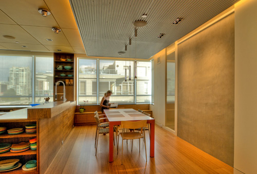
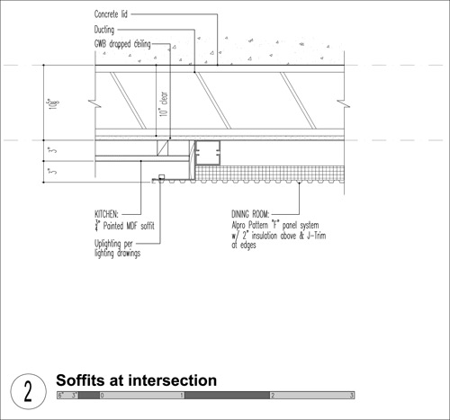
The slightly higher soffit at the kitchen provides a clean grid to define the kitchen area, it organize the systems (lighting, fire sprinklers, and speakers), and provides an opportunity for an additional color to the interior palette. The ¾” thick painted mdf panels have a rabbet joint at each side so that the seams disappear in the shadow line.

Near the entry a portion of the Alpro soffit bends down to screen the dining room from the front door.

BUILD World Headquarters
Our very own office space uses two separate and overlapping soffits. The lower Alpro corrugated perforated soffit defines the desk area, scales the desk area appropriately (where we’re usually sitting down), conceals the housing for the lighting, hides the systems (ducting, speakers) and improves the acoustics.
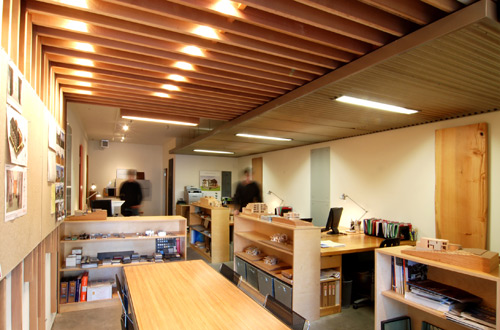
The higher cedar slat soffit defines the meeting area, organizes the downlighting and provides visual warmth. The cedar slats turn down the wall and provide a place to mount Homasote panels for our working wall.

Case studies – some projects by other architects
There are exceptional examples of soffits out there by some of our favorite architects. Take a look at our selection below and hit those links to see more from these stellar groups.
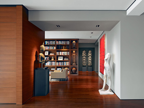
We’re big fans of Zack | de Vito and their Russian Hill High-Rise Condominium introduces clever soffit design into a sophisticated interior.
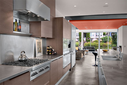
The Sawtooth House by E. Cobb Architects employs a soffit with a bright, bold color to complement the palette.
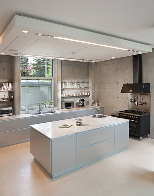
We like that the soffit by Dror Barda brings a technical aesthetic to the kitchen lid. We’re not sure what all is going on up in there, but it looks very important.
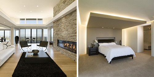
The Olive Tree Residence by Mark English Architects uses soffits to create a sensual and peaceful interior. The living room skillfully employs a soffit to frame the space and bring the scale down to a human level.
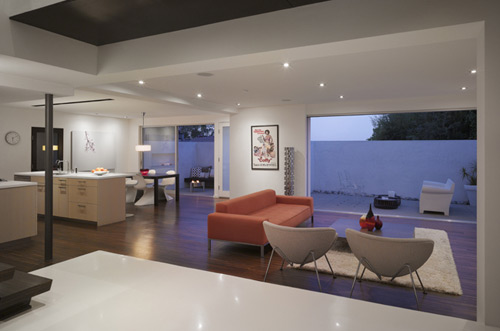
In the Hollywood Hills Residence by Griffin Enright Architects the soffits take on the shape of large coffered ceilings, lending a handsome depth to the space.
Turn Collaborative uses the soffit as light shelf in their Superior Residence.
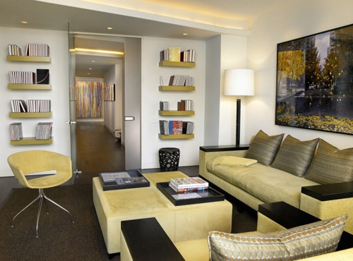
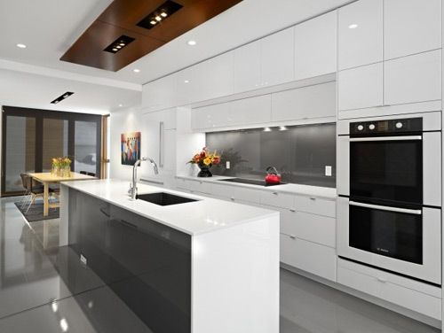
The sleek, modern kitchen of the LG House by Thirdstone is balanced out with what appears to be dark wood tones at the soffit above.
In their D-House Bunker Workshop cleverly uses the soffit as a sculpture to fill the space above the kitchen area.

Got a favorite soffit? Hit that comments button.
Cheers from team BUILD


