[Image Credit: BUILD LLC]
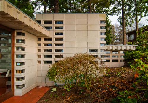
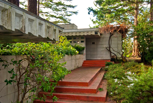
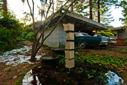
Last weekend we had the rare opportunity to visit one of only 3 Frank Lloyd Wright houses here in Washington State. Recently touted as one of Seattle’s 10 Greatest Homes, the Tracy House is a mid-century gem located in Normandy Park (approximately 30 minutes south of Seattle), and it also has the distinct honor of being listed on the National Registry of Historic Places. The house was designed and built for William and Elizabeth Tracy from 1954 to 1955, and they were the sole owners until Elizabeth’s passing a couple years ago. We were extremely honored to see such an exceptional piece of architecture and want to extend our thanks to the organizer, tour guide, and Wright aficionado, Larry Woodin.
[Image Credit: BUILD LLC]
While the tour offered an exclusive look at a private residence designed by, perhaps, the most celebrated of American Architects, there was something more serendipitous that struck us. The Tracy house is a remarkable example of Wright’s Usonian Automats – a series of residential designs intended for the middle class. The floor plan is a modest 1,150 square feet which includes 3 simple bedrooms and only the necessary common areas, nothing more. At the same time it seems to have offered the inhabitants a perfectly comfortable life.
[Image Credit: Larry Woodin]
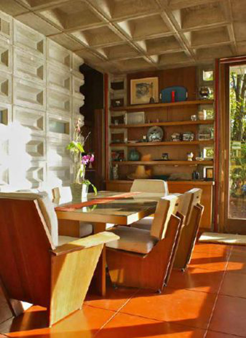
Architecturally, the house demonstrates so many ideals of good design; all the characteristics that we’re always chattering on about with regard to smarter, smaller dwellings. Psychologically, everything had been thought about –even how the interior shadows from natural daylight would change over the course of a day. As far as sustainability, don’t even get us started; given that this house will easily last 100 years, its carbon footprint is negligible compared to the average modern day “green” home (even with its single pane windows). The house embodies a philosophy of design that is now more critical than ever.
[Image Credit: BUILD LLC]
In organizing our own thoughts we wondered about the constituent components that contribute to such an efficient whole. So we did what we do; we broke it down into our top 10 list of design concepts that make this residence so successful. It could just as easily be called 10 architectural tips for smaller floor plans. Here goes:
1. Everything it needs to be and nothing more: There’s no “bonus room/video game room” or other superfluous space that doesn’t have a primary purpose.
[Image Credit: Larry Woodin]
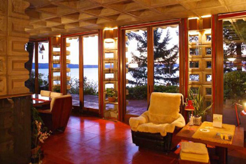
2. Indoor/outdoor spaces: The terrace was designed with the same intention and thoughtfulness as any room inside the home. Given the careful siting and coziness of the terrace, we’re willing to bet that it’s contributed an essential function to the home over the decades.
[Image Credit: BUILD LLC]
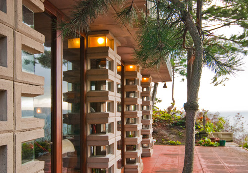
4. Deliberate views: Sightlines from the home’s common areas offer clear views over the bluff and out onto the Puget Sound. The expansive view balances out the intimate feel of the interiors.

[Image Credit: BUILD LLC]
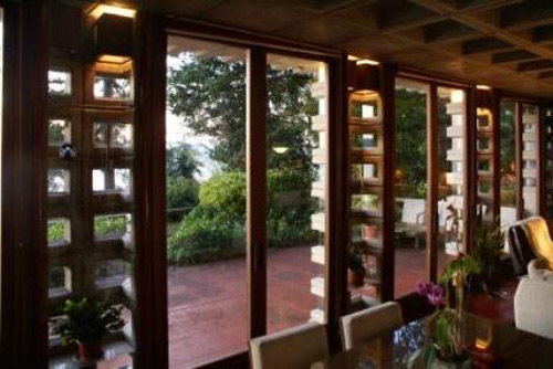
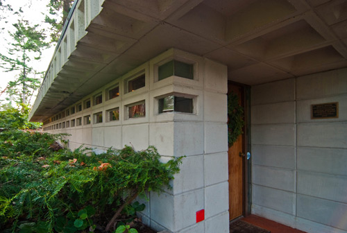
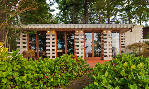
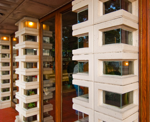
6. Dynamic spaces: Relief within the concrete walls as well as the intentional breaks of the window bays offer light conditions and shadows that constantly change throughout the day. Apparently there’s even a specific location for flowers based on the shadow patterns between dawn and dusk.
[Image Credit: BUILD LLC]
7. Bedrooms that are just bedrooms: The bedrooms are simple and straight-forward, maintaining their use as places of sleep and rest, while encouraging The Tracys to use the common areas for up and about activities.
8. Walls of glass: This opens the interiors up to the terrace, the view and an abundance of natural light.
[Image Credit: BUILD LLC]
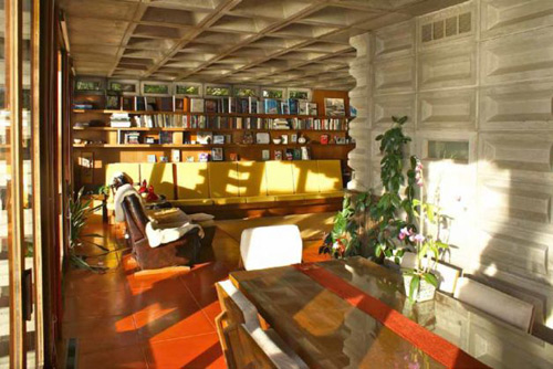
9. Built-in seating: Designed correctly it allows less wasted space in the living room and creates a harmonious feel at the interiors.
[Image Credit: Larry Woodin]
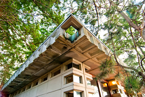
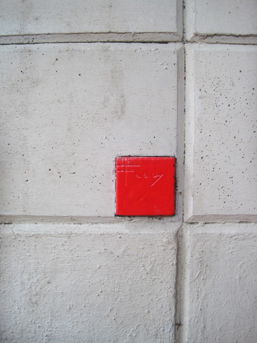
10. Integrated components: Items like lights and scuppers, that are designed into the structure and the concrete block geometry, don’t necessarily save space but lend a feeling of everything being in the right place.
[Image Credit: BUILD LLC]
If you made it to this tour let us know what thoughts you came away with. If you missed this one, stay tuned to the BUILDblog, we’ve got the scoop on the next Frank Lloyd Wright house tour.
You can check out some additional resources about the house here, here, and here.
[Image Credit: sahafoto]
Big thanks to Larry Woodin at ecohome@mindspring.com.
Cheers from Team BUILD


