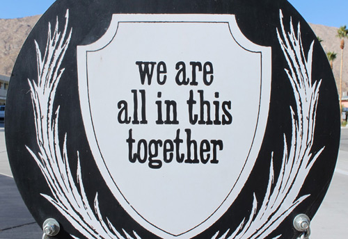
If you haven’t had the pleasure of staying at one of the four ACE Hotels around the country, we highly recommend booking your next vacation based on the hotel first and the location second. For architects, designers and well, anyone design-conscious, staying at an ACE Hotel is an exploration in fresh ideas and smart implementations. Every time you turn a corner, enter a new room, or decide to hit the gym, you are pleasantly surprised with a dose of innovative design. An important part of the design chemistry is that there’s usually clever signage that gives your day that little boost of happiness.
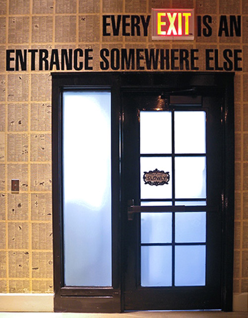
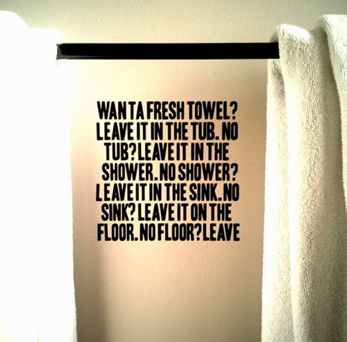
As far as design ideas go, simple little signs like these might be the most bang for design buck that we’ve ever experienced. For the cost of some rub-on letters, a designer can create instant happiness. It’s hard to ignore the trouble that some interiors go to (and exteriors for that matter) trying to evoke the joy that could have just as easily been achieved from a sentence or two. It’s witty, attenuated and quite modern, really.
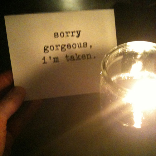
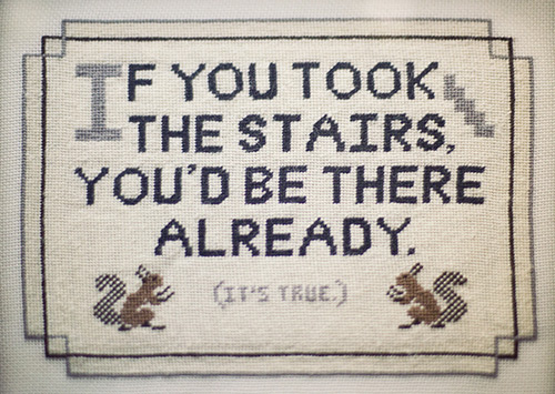
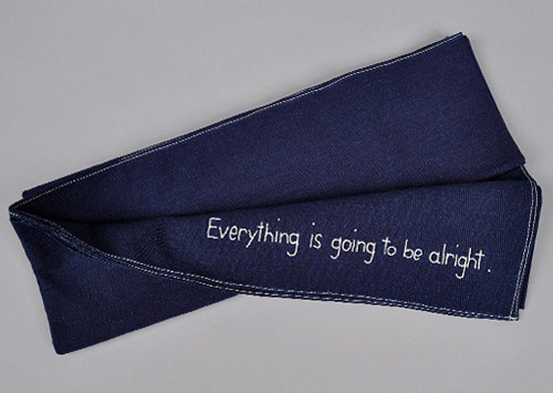
We’re big fans of scrappy solutions, cost-effective design ideas, and getting out of the established design ruts; and these simple little (and nearly free) signs grabbed our attention from the moment we entered an ACE Hotel. Today’s post is a gallery celebrating what we consider to be a brilliant design strategy.


Cheers and see you at the ACE –we’ll be the ones at the bar tipping back Manhattans.
