More and more, we’re being asked to lecture about our design-build work, office culture and social media strategies. And while we’re no experts at lecturing, we’re really starting to enjoy it. Giving a presentation on what you love doing for a living is a ton of fun and it’s always an honor to receive invites from the organizations and institutions that host us.
In any lecture (architecture or otherwise), there are careful decisions to be made: which slides to choose and how many, what direction the narrative thread should follow, what thoughts you leave the audience with, the level of interaction in the room, and so forth. The number of dials you need to keep your hands on can be overwhelming, and a good lecture balances all of these variables with one another.
We like to do quite a bit of homework prior to our lectures; time is a valuable commodity for everyone in the audience and our aim is to deliver the most pertinent information in an effective amount of time – and make it enjoyable to absorb. So we look to an inspiring group of individuals for their abilities in public speaking, visual presentation and connecting with people. They’ve become a resource that’s so important to our presentations that we thought you might enjoy hearing a bit more about them. Today’s post is a quick review of the sharp-shooters who influence our presentations. If you lecture (or want to in the future), we highly recommend becoming familiar with this list.

Paul Arden
We’re big fans of the late, great Arden (1940 – 2008) for his philosophy of sharing and his ability to flip the advertising world on its head. One of his famous quotes has become a core value of ours, especially with lectures:
![]() Do not covet your ideas. Give away everything you know and more will come back to you.
Do not covet your ideas. Give away everything you know and more will come back to you.
You probably remember from school days other students preventing you from seeing their answers by placing their arm around their exercise book or exam paper. It’s the same at work, people are secretive with ideas – Don’t tell them that, they’ll take credit for it. The problem with hoarding is that you end up living off your reserves. Eventually, you become stale. If you give away everything you have, you’re left with nothing. But it forces you to think and act differently: to look, to be aware, to replenish. And somehow, the more you give away, the more comes back to you. Ideas are open knowledge. Don’t claim ownership, they’re not your ideas anyway. They are out there floating in the ether. You just have to put yourself in a frame of mind to pick them up.

Guy Kawasaki
Kawasaki’s rule of 10-20-30 has re-engineered presentations for the digital age. He believes that in order to give an effective presentation, the presenter needs to honor the time and attention span of the audience by structuring the format – kudos to that! He proposes a simple presentation framework and we find that it is the primary DNA of any good presentation:
Ten slides, twenty minutes, thirty-point font.
1. Problem
2. Your solution
3. Business model
4. Underlying magic/technology
5. Marketing and sales
6. Competition
7. Team
8. Projections and milestones
9. Status and timeline
10. Summary and call to action

Chase Jarvis
We’re huge fans of Jarvis’ pure charisma and raw straight-forwardness onstage. We’ve learned a ton from him over the years about lecturing, and these are our 3 favorite pointers:
Talk about the stuff you already know. When you talk about the material that you deal with on a day-to-day basis, the stuff that you’re passionate about, you don’t need to memorize anything or stick to a script – you can shoot from the hip.
Don’t worry about being an expert on Architecture (or whatever your profession may be). The audience is there to see you speak and you’re already an expert on you and what you do.
Design your slides as visual cues of your talking points. A quick glance at your next slide should prompt your next couple of talking points.

Nicolas Felton
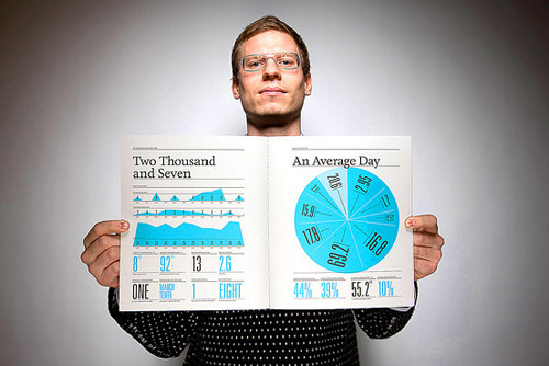
Make your data exciting. Felton has been refining the art of visual information for years, turning raw data into mesmerizing illustrations. Introducing a variety of deliberate font types and sizes supplemented with charts, graphs and maps entices the viewer; humor, candor, and detailed content sustains their undivided attention. Same data, smarter interface.


Bob Borson
The driving force behind the blog Life of an Architect, Bob is also a professional architect, world traveler and lecturer extraordinaire. His easy Texas cadence combined with a calm stage presence makes for a lecture that delivers authentic knowledge and connects with people. His recent post on giving presentations gets to the heart of being yourself onstage – a more presentable, purposeful, funnier self.
![]() Try and be comfortable in your own body. If you aren’t a suit a tie person, don’t pick presentation day to change.
Try and be comfortable in your own body. If you aren’t a suit a tie person, don’t pick presentation day to change.
![]() Tell a story. Telling a story personalizes the information and connects people to your big idea.
Tell a story. Telling a story personalizes the information and connects people to your big idea.
![]() Pay just a little attention to how the space is lit and make sure that you are standing in the light. If people can’t see you, they can’t hear you. It really is that simple.
Pay just a little attention to how the space is lit and make sure that you are standing in the light. If people can’t see you, they can’t hear you. It really is that simple.
As always, let us know who you look to for a good lecture.
Cheers and happy new year from team BUILD


