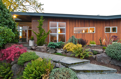
[All photos by BUILD LLC]
BUILD just put the finishing touches on a Mid-Century Modern home in Seattle’s View Ridge neighborhood; a community filled with handsome MCM models. This project is a great example of bringing an older residence up to 21st century standards, while retaining the original charm of the home. The design and construction of an existing structure is always tricky to navigate, especially when key items are important to the home’s character. Subsequently, we rely on systems that have proved themselves over the course of numerous projects. The Guide to Updating Mid-Century Modern Homes is a good starting point and working with extraordinary clients who possess a keen sense of humor definitely helps. Today’s post breaks down the remodel into its constituent parts and calls out the specifications and links to fixtures, appliances, materials and all sorts of good stuff. Enjoy the read and let us know what you think.
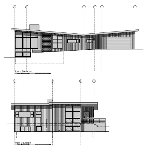

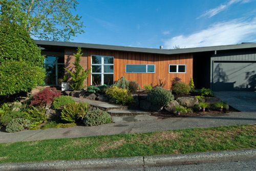
Exterior
The original T&G cedar siding on the house was replaced and finished with a Sikkens natural cedar semi-transparent stain. Adding a bit of pigment to the stain helps the clear cedar with the inevitable weathering that occurs here in the Pacific Northwest. We painted the garage portion a charcoal grey to fade it back a bit and allow the brick and cedar to stand out. New clear anodized aluminum windows do double duty by keeping the heat in and sharpening up the façade.

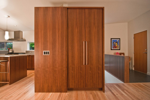
Entry
Without ample room for a formally enclosed closet, our SPD cabinet shop developed a clever cabinet box to house coats and provide visual separation among spaces while blending in with the adjacent cabinetry.
Living Room
Retaining the original window geometry, the vaulted living room was outfitted with new Milgard Anodized Aluminum windows. Existing red oak floors were refinished with a white stain by Olde English Hardwoods, Inc.
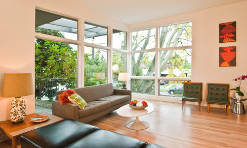
With the homeowners’ sharp eyes for design, the existing furnishings were a perfect match for the updated home (albeit there was debate over a certain table). To retain some of the historical character and maintain warmth of texture, the existing stone fireplace and wood panel wall above were preserved.

Kitchen
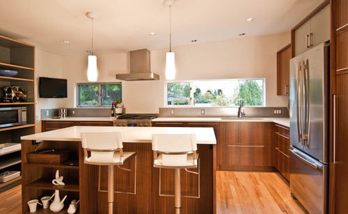
The kitchen was reorganized to open up the room and allow for ample daylight to spill into a seamless kitchen and dining area. The elimination of walls that break up rooms within MCM homes and the addition of key items like an island allow for flexibility between daily use and entertaining. A light color palette on countertop surfaces achieves a desirably bright and airy quality to the overall space.

SPECIFICATIONS
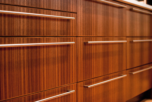
Base and upper cabinets are 3/4” sequenced vertical grain walnut veneer
The open cubby storage cabinets are made of gray Wilsonart laminate on Europly with exposed edges
The countertops, side panels and cabinet pulls all flush out for a clean look.
All cabinets by the Special Projects Division cabinet shop
Chroma countertops with stainless steel backsplash (non-directional finish) are used throughout
The pulls are stainless steel Sugatsune 1000 series
Drawer slides, door hinges and a range of organizers are supplied by Blum’s Motion line
The can lights are 5” diameter recessed down-lights by Lightolier
The pendant lights are Rondelle mini pendants in white
A custom stainless steel sink was designed by BUILD and fabricated by Metal Masters Northwest
We like to mount a low profile button to garbage disposal at the countertop
The faucet is a Brizo Solna single handle with pull down
The refrigerator and range are both Jenn-Air, the hood is a Zephyr and the dishwasher is a Miele
Bathrooms
In order to keep the bathroom open and spacious, the walnut veneer vanity from our SPD cabinet shop is wall-hung 10″ above the floor. A common challenge of updating an MCM bathroom is bringing natural light into a typically small space. A light and bright palette with lines kept simple and unencumbered makes a significant difference; frameless glass panels at the shower enclosure also allow the light to reach deep into the space.


SPECIFICATIONS
Base cabinets are 3/4” sequenced vertical grain walnut veneer topped with Chroma countertops
Frameless glass shower enclosure by Distinctive Glass Inc.
The pulls are also Sugatsune to create a consistent hardware package throughout the home
Tile was provided by Pental and Daltile
The mirror light is an AAMSCO Alinea model
A one piece frameless mirror is used to create a clean, modern plane
Towel bars were supplied by CR Laurence
The shower fixtures are the Stillness series by Kohler
The sink is a Kohler Ladena and the faucet is the G-6102 M.E.2 by Graff

Hit that comments button and let us know what you think.
Additional photos that didn’t make the cut can be found on our Facebook Page.
For a daily design chatter, follow us on Twitter.


