[All images by BUILD LLC]
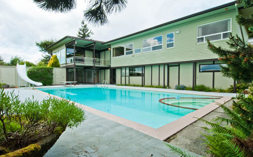
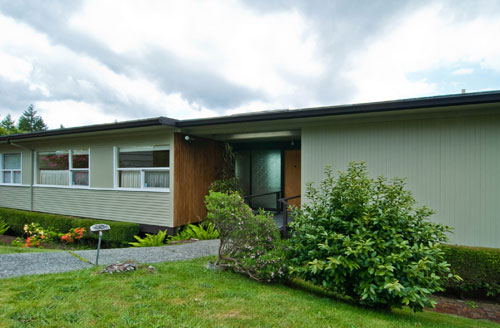
Recently we started design work for an existing home in the renowned Hilltop neighborhood -a mid-century modern planned community developed about 15 miles outside of Seattle. The original home was designed in 1954 by Van Horne & Van Horne with Pat Prechek and it’s exactly what we love working on –taking an exceptional piece of older architecture and updating it for the 21st century. Adding a new layer on top and breathing new life into something special.

It’s an extraordinary project for many reasons;
1. The house is deliberately and carefully positioned on the site and the approach is a pleasant sequence of experiences and views.
2. While the landscaping is overgrown, it’s also mature and can be pruned back to an ideal state –the type of trees and vegetation that all good architectural renderings forecast.
3. The house is a textbook study of the design ideals of mid-century modern design; the structure exemplifies a rational exposed grid and the skin is composed of large walls of glass.
4. The house and its neighbors make for one of the most important residential community studies in the Pacific Northwest; the 40 lots were intentionally designed for livability and efficiency, the houses were authored by a handful of Seattle’s most renowned architects.
5. The homeowners are sharp and savvy; they understand the qualities of MCM design and hope to retain the character and poetics with the updated home.

Needless to say, we dove into the project with great excitement and a healthy dose of MCM discipline. While the design process for this particular project has many fulfilling attributes, the most notable isn’t the most obvious.

Most gratifying of all the aspects is picking up the thread of design left by the modern master architects of the mid-century. These architects were visionaries; society was enrolled out of country cottages and into straight lines, open spaces and clean living. They were bold; interiors were opened up and walls of glass turned structures transparent. They were courageous; new ways of living were proposed and communities were designed as deliberate environments.

As part of remodeling this home, we think it’s imperative to reveal and understand the DNA of the original design –the fundamental source of its design language. This language includes several key aspects:
1. Simple volumes that look like what they’re doing; large windows at common areas, smaller apertures at private areas.
2. A clear separation of functions: common areas, circulation areas and private areas.
3. A dependent and harmonious relationship between the house and landscape elements (namely the pool).
4. Overhangs and posts to allow the massing to touch the ground lightly.
5. Long horizontal lines.
6. Walls of glass.
7. An exposed double joist frame with bays spaced at a regular intervals.
8. Authenticity in materials; items like the car decking is exposed and becomes part of the aesthetic.
9. Clerestory windows to allow the roof to “float”.
10. Intentional views framed by vegetation.
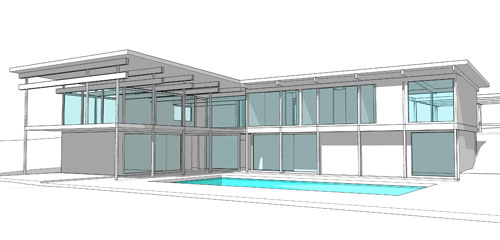
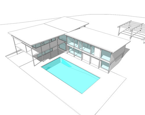
There are many more, but these 10 struck us as fundamental to the architectural language. Our design intent is to weave the new work into this language. The house should look new and modern, at the same time a truly masterful remodel may not be evident in the finished product -it may pleasantly disappear into the composition. The diagrams below outline 5 schemes in which this language is being applied with 5 different strategies (each with a corresponding budget level).

While rudimentary at this stage, the digital models below suggest extensions to the existing home using the interval bays and exposed joist framing found in the original language.


We’ll be covering this project from beginning to end, so stay tuned for more explorations and deciphering the threads of the MCM masters.
Cheers from team BUILD.


