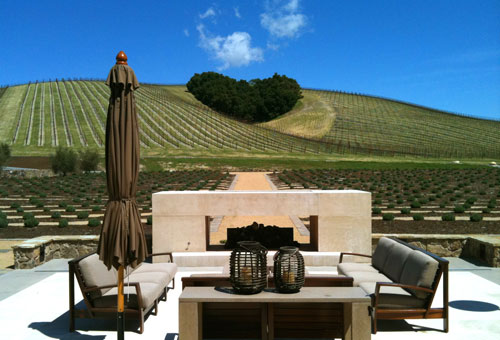
A couple of weeks ago we were down in San Luis Obispo visiting the Cal Poly campus. Afterward, team BUILD grabbed some R&R just north in the Paso Robles Wine Country. It’s a gorgeous region with rolling green hills, cattle dotting the landscape and puffy white clouds meandering through blue skies. We stopped in at a very good winery and sidled up to the tasting bar. It didn’t take long before the tasting room filled up with a savvy crowd of wine enthusiasts.
It was a picture perfect scene; attractive people drinking Cabs and mingling amongst themselves -all framed by an expansive stone room capped with exposed wood trusses. Floor to ceiling windows showed off a terrace and neat rows of vines stretching to the horizon. Everything seemed perfectly placed, each item appeared deliberately positioned inside and out.
…then we started doing what architects do; we wandered, we touched, we sat in the chairs and studied the objects that were carefully arranged on the tables. Basically we used the space. And a funny thing happened; the spaces didn’t really work. The chairs on the terrace were too far apart to sit and have a conversation and despite a tasting room full of patrons, no one even went near the sitting area. The outdoor fireplace was too distant from the sitting area to provide much warmth if it were lit and, upon closer inspection, the fireplace didn’t appear to have ever held a fire. There was no evidence of charred wood, smoke or a gas igniter. The stone building in the background was the “boutique winery” as the woman behind the tasting bar called it; she went on to explain that they don’t actually make the wine there. Back inside, the enormous glass windows of the tasting room were designed with mullions right at eye level, infringing on the spectacular view. We felt rather odd in the spaces –as if our human proportions were a bit off.
Why did a setting so intentionally designed contain such dissonance? Why was a place so expensive to construct so awkward to experience? We drank wine and discussed this curiosity and drank more wine until finally it came to us. This place wasn’t designed for people, it was designed for photographs. It was designed for people to look at an image and visualize the extraordinary lifestyle the winery offers. Sitting around the warm glow of the fire enjoying a bottle of Petite Syrah with good friends as the sun goes down behind the vineyards, ah just another perfect end to a typical day in Southern California <queue the sound of glasses clinking>.

It’s brilliant in a way. It is of greater benefit to the winery if the majority of people don’t go out to the terrace, but instead, simply look out the window and fantasize about the lifestyle they could be living. But this isn’t really about the winery, rather it is about how marketing has changed design. The lifestyle image has become so infectious and lucrative in our photo saturated world that there is an important distinction to be aware of in design; there is design for people and design for photos -and sometimes they’re mutually exclusive.
As lifestyle architects we find all of this to be a bit disturbing. Shouldn’t good design offer both usefulness AND nice photographs? When the finished photos alone dictate the design, it puts the cart before the horse sacrifices the function of the design. It turns architecture into a stage set and it turns architects into exterior decorators. Most unfortunate of all is a scenario where the client commissions one and gets the other. Bummer.
So here’s to toast to architecture for people. Architecture that is functional, sensible and usable. Architecture that still produces finished photos, but photos that are simply an extension of these characteristics. < queue the sound of glasses clinking>.
Cheers


