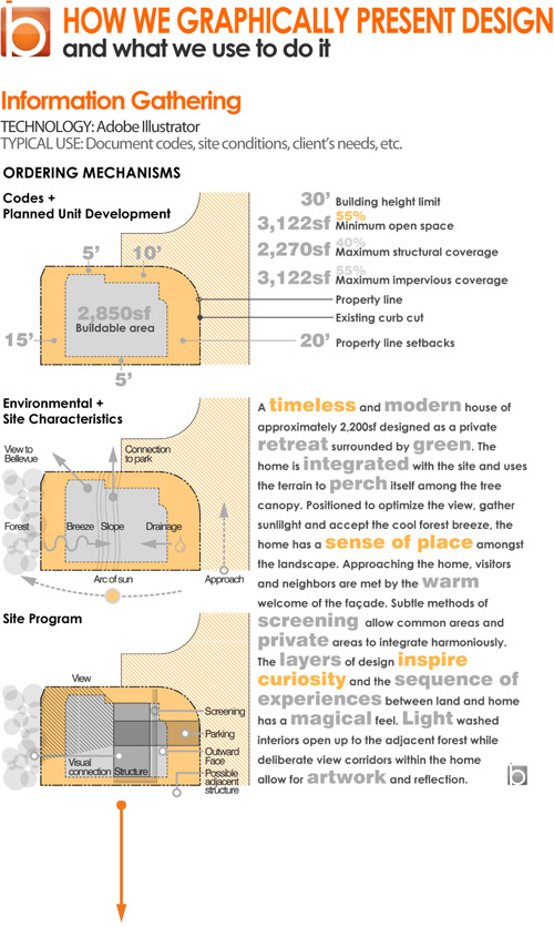
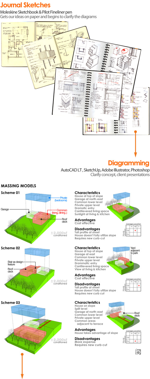
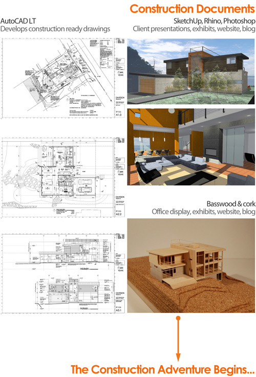
 We were recently asked by a BUILDblog reader about how we generate graphic presentations. It’s a great question and one that seemed like it would make a good blog post. There are a number of different reasons that we put together graphic presentations; client meetings, blog posts, office display on our working wall, architectural exhibits and simply to record our thoughts and clarify our ideas. While we’ve experimented over the years with various mediums, we’ve found a few patterns that work well for us and convey ideas properly to clients. It’s always a balancing act between representing ideas accurately and being efficient with a project’s design budget. A big part of the equation is getting people inspired and enrolled in the design with straight-forward methods. The right software and techniques can make a tremendous difference with these variables; knowing how to use them appropriately can lead to successful outcomes every time. Interestingly enough, more expensive, more sophisticated technology doesn’t always produce the most effective outcome. So in the philosophy of transparency and sharing what we know, we’ve put together a diagrammatic timeline of the various graphic stages we go through for each phase of an architectural project –each stage notes the technology we use to achieve the results.


For more design talk follow us on Twitter.


