Typically, we like to let materials be exactly what they are. Steel should look like steel, wood should look like wood and stone should look like stone. The beauty and usefulness of these materials is in their natural character. We feel very strongly about this aesthetic for several reasons:
1. Nature has already done all the hard work -all the texture, color and pattern is already embedded in the material. If represented correctly, the unique character of each material can become subtle ornamentation within the design. Some examples of this are the uneven grain pattern in a board of vertical grain Douglas Fir or the mill scale on the surface of hot-rolled steel. It’s always a shame to see all that hard work covered up.
2. To us, being modern is being authentic. How a house or a building looks should be an honest representation of what the house or building is doing. Cladding a concrete foundation with river-rock to look like something built 150 years ago is an illusion. It’s wall-paper. In our opinion it’s visually deceiving and it’s not a wise way to spend construction dollars.
3. To us, being modern is also showing a respect for structural engineering and physics in general. If it takes a steel beam to hold up a roof structure then you should see a steel beam holding up the roof structure.
4. Letting materials look like themselves is usually more cost effective. Making a steel beam look like a wood beam is a counter-intuitive way to spend time and money.
Obviously these points each have their exceptions and rarely does a project hold true to all of these qualities from beginning to end. In fact, sometimes the poetry in design depends on how you break the rules. But without believing in some basic principles (whether yours are similar to ours or not) the discipline of design is easily lost and you’re left living or working in something that doesn’t have a soul.
Recently on a project, our ideas about material purity were put to the test. The existing mid-century modern home has good bones (the framing and foundation are in very good condition) and key areas of the exterior are clad in stone. The stone is typical of 1950’s construction; highly textured horizontal layers of what is most likely limestone. The stone walls are carefully situated and add a handsome composition to the exterior of the home. The texture and shadows of the stone also balance out the simplicity of the interiors. In a nutshell, we’re big fans of the stone. Unfortunately all of the stone was painted beige.


Our original plan was to remove the paint either through a chemical process or by sandblasting the walls. The vision was to restore the stone walls to their natural state; thereby bringing a texture, color and pattern to the home that is, technically, already there. Our hope was to achieve something in between these two examples:

The first attempt was with a chemical process that wasn’t able to remove the paint uniformly. Given the highly textured surface of the stone, too much paint remained in the nooks and crannies. The overall look was poor and so we abandoned the chemical process.
The second attempt utilized a sand-blaster and it did a thorough job of removing the paint –so thorough, in fact, that it was removing a significant amount of the grout at the joints in between the stones. Continuing with this method would have necessitated all of the stone to be re-grouted. So we put down the sandblaster and went back to the drawing board.
Neither of the paint removal methods seemed to be a cost-effective solution for the stone. The natural look of the stone could be brought back of course – but the cost of doing so was looking to be rather ineffective the further along we got.
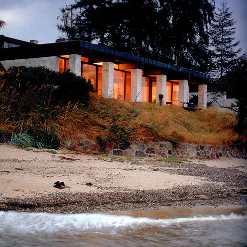
When we’re in a jam, it’s not unusual for us to look to the Scandinavians and this was no exception. Thinking back to our studies in Denmark, it seemed like the Danes were always painting brick and stone. Every time you turned around they were painting another brick wall. And it worked -they retained the texture of the brick and typically used a shade of white or yellow to lighten up the long, dark Scandinavian winters. Here are some examples from one of our favorite books, Scandinavian Modern Houses:


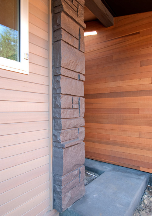
The 180 degree change of direction led to several test swatches of paint on the brick, we narrowed down the colors with the homeowners and eventually selected a charcoal tone that complimented the stained T&G vertical cedar siding and anodized aluminum windows. It lends a nice texture and also provides a striking contrast to the leafy green landscaping.


Did the decision keep to the purity of the material and abide by our bullet points above? Probably not. Was it worth breaking the rules for? We think so. The solution was cost-effective, kept the process on track and the end result looks good. Like having a kit-of-parts is a sensible design strategy, it’s also good to have a bag of tricks. And while we’re very judicious with the use of paint, it seems reasonable to paint something that’s already painted.

Cheers from team BUILD. For more design talk follow us on Twitter.


