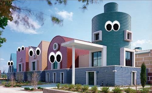
[St. Coletta School in Washington DC by Michael Graves, 2006]
Let’s be perfectly clear, we hate post-modernism architecture. The architectural style, based on the nostalgia of architectures past, tries too hard to be something that it’s not. It’s a clumsy amalgamation of disparate architectural elements; a Beaux-Arts frieze here and a Greek Corinthian column there; maybe round it all off with a Romanesque tower and throw in few craftsman style knee braces for good measure… oh and it’s got to have air conditioning and mirrored plate glass windows. It’s pretend architecture and it’s terrifying to most of us architects. Back in grad-school the entire post-modernism movement was summed up in 5 words “buildings with funny little tops”. Post modernism taught society that it’s okay to take a few peel-n-stick doric columns and slap them onto the front of your house. Post modernism could be the worst thing that ever happened to architecture.
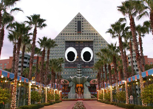
[Dolphin Hotel in Orlando Florida by Michael Graves, 1987]
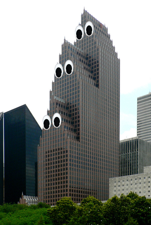
[Bank of America Building in Houston Texas by Philip Johnson, 1983]
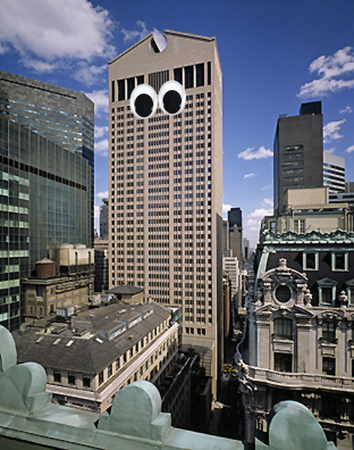
[AT&T Building in New York City by Philip Johnson, 1984]
The postmodern movement (and it’s funny little tops) set architecture back about a hundred years in our opinion; and given that we’re only going to be designing hot, modern buildings for a portion of that setback, we’re a bit perturbed.
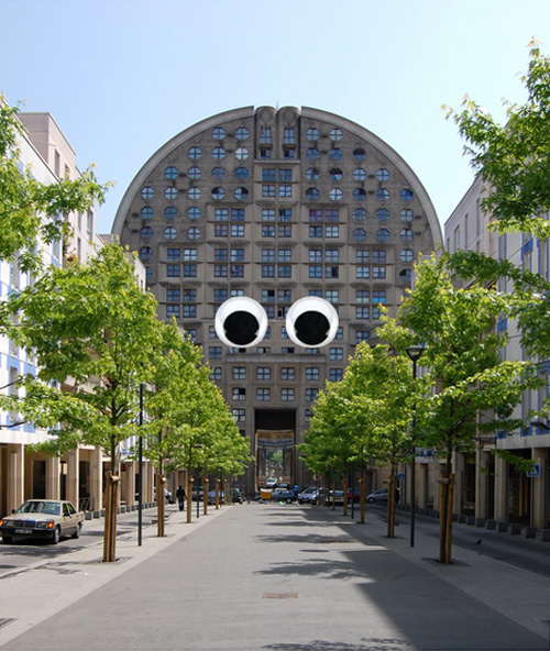
[Les Arènes de Picasso in Paris by Manuel Nuñez Yanowsky, 1984]
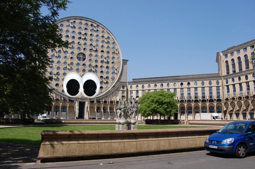
[Les Arènes de Picasso in Paris by Manuel Nuñez Yanowsky, 1984]
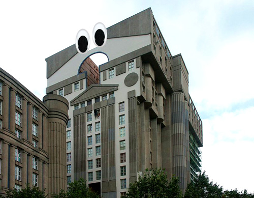
[Les Espaces d’Abraxas in Paris by Ricardo Bofill, 1983]
It would be easy enough to forget this unfortunate architectural era and move on, but they’re everywhere. Every city’s got one and they always seem to be in the most prominent locations. It’s as if Michael Graves was given the choice plot of land in every important city to run wild with his Franken-building visions.
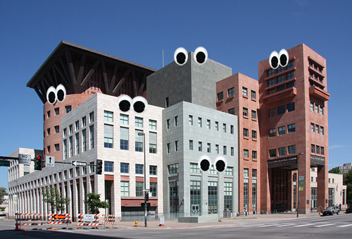
[Denver Public Library by Michael Graves, 1995]
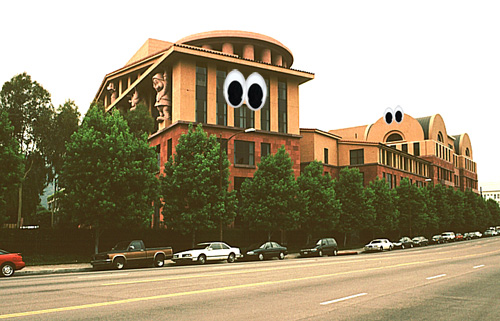
[Team Disney Building in Burbank, California by Michael Graves, 1991]
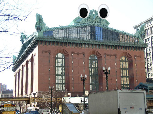
[Harold Washington Library in Chicago by Hammond, Beeby and Babka, 1991]
But despite the abundance of post-modern architecture, we’re making progress. It’s not easy but we’re confronting the postmodern era head-on after an important epiphany. We had this epiphany while lying down on a black leather Mies van der Rohe Barcelona day-bed and staring up at the perfectly gridded white ceiling of our psychiatrist’s dimly lit office <queue the cigarette smoke and dialogue about our early years in the design industry>. We needed to give postmodern architecture a personality; something human to relate to; a means of acceptance.
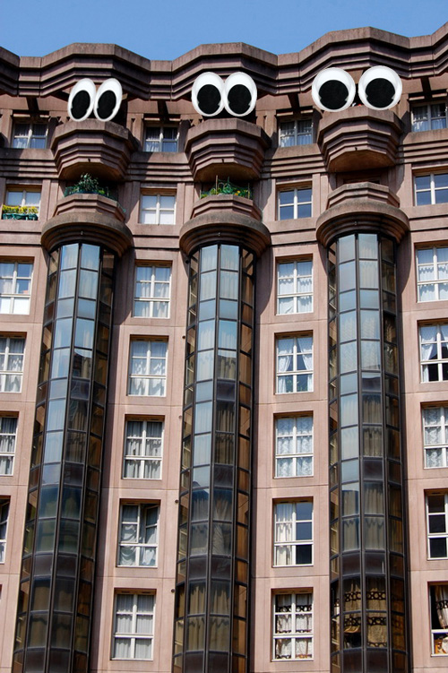
[Les Espaces d’Abraxas in Paris by Ricardo Bofill, 1983]
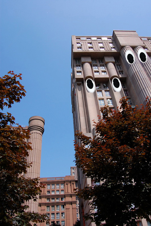
[Les Espaces d’Abraxas in Paris by Ricardo Bofill, 1983]
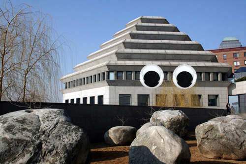
[Museum of Jewish Heritage in New York City by Roche Dinkeloo, 1994]
So we moved forward in the only way we knew how; by making the postmodern era more authentic and honest. There was only one answer really, and it was staring us right in the face: Googly-Eyes. By placing Googly-Eyes on the postmodern tragedies of the 1980’s we’re able to see the structures for who they really are. We’re able to meet them eye to eye, understand them, and move on with our careers. Thanks to Googly-Eye Buildings we’re able to let the healing process begin.
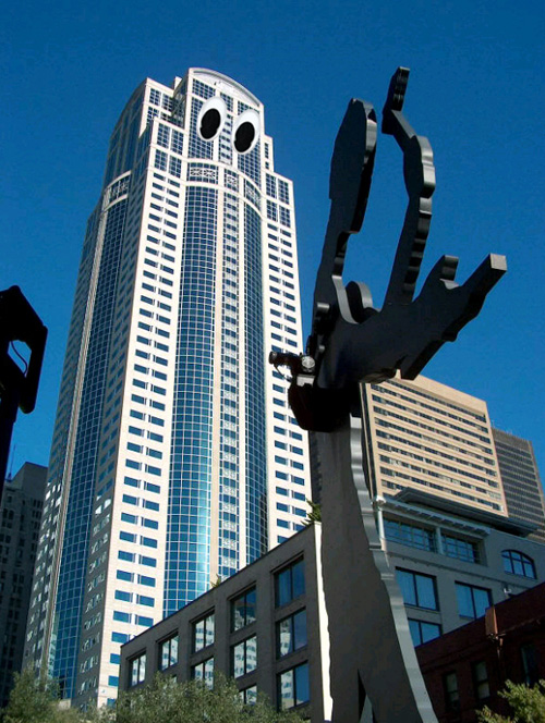
[Washington Mutual Tower in Seattle by KPF, 1988]
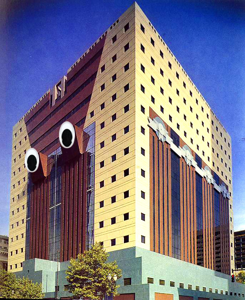
[Portland Building in Portland OR by Michael Graves, 1982]
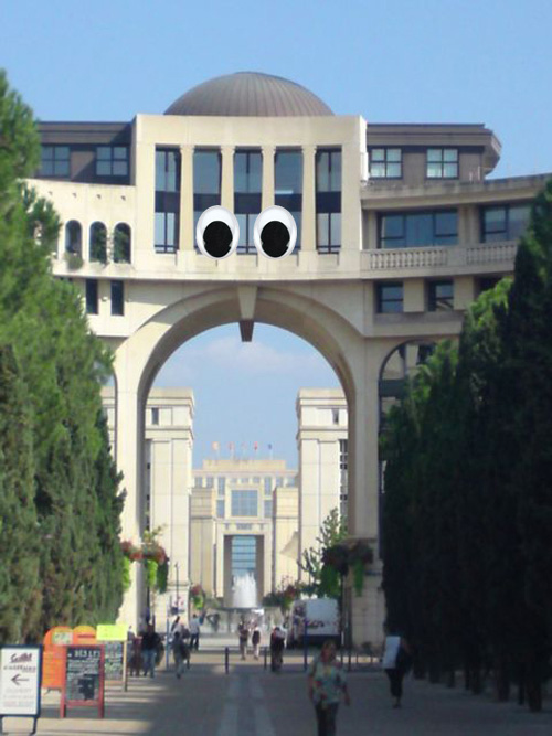
[Antigone in Montpellier, France by Ricardo Bofill, 1978-2000]
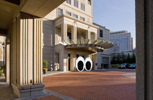
[Mansion on Peachtree in Atlanta Georgia by Robert A.M. Stern, 2008]
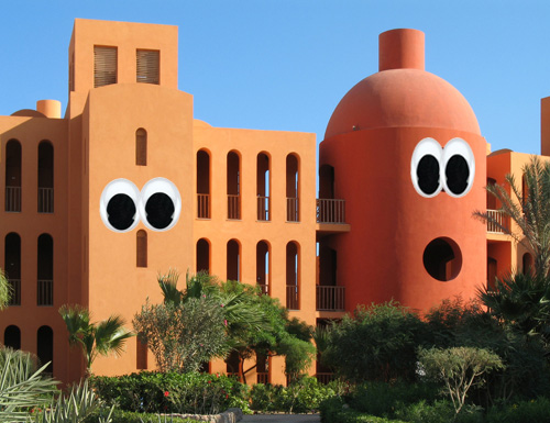
[Steigenberger Hotel in El Gouna, Egypt by Michael Graves]
For more design talk and general tomfoolery follow us on Twitter.


