Recently we did some traveling up north; to Vancouver Island, then up through the inside passage to Alaska. While the natural wonders of this part of the world are well known and well documented, we had very few expectations in terms of the architecture and urban design. We were thrilled to reach Anchorage and find handsome design, ambitious ideas and forward thinking construction. Admittedly, we didn’t think Alaska would be pushing the architectural envelope; however we found several project types that rival, if not beat, most of the architecture here in the northwest. Here’s our top 5, hit that comments button if you’ve got others.
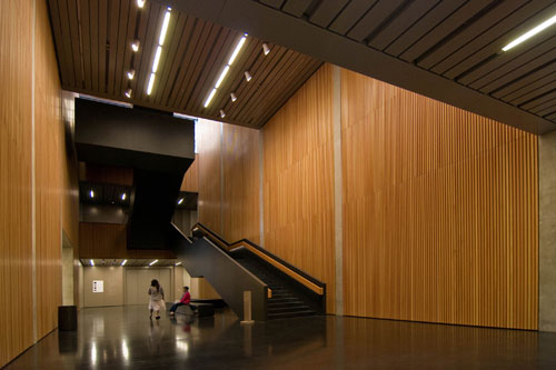
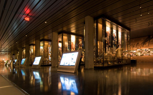
The Anchorage Museum at Rasmuson Center, addition by David Chipperfield
The building itself is handsome, well disciplined and at the same time wonderfully inspiring. It’s cool, sleek skin shelters a warm interior. You feel at peace walking through the galleries, each filtering light in a slightly different but subtle way. Permanent exhibits do a beautiful job of displaying the many indigenous cultures of Alaska and the taxidermy collection (one of our favorite displays) was entirely awesome. We’re huge fans.
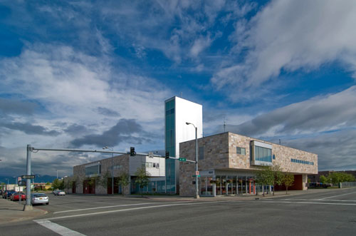
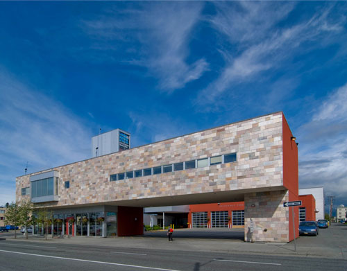
Fire Station One by KPB Architects
A confident and substantial building, just like a fire-station should be. In addition to the daring forms, we like the transparency which allows the public a peak into the facilities. The architects set up a series of geometrical and material rules that guide the design and it comes across quite well. A big kudos to team KPB.
Townhomes
We just about drove off the road when we saw these townhouses at A Street and W 15th Ave. Crisp and clean, the envelope is wrapped with a steel rainscreen, a green weather-barrier behind gives off a subtly cool glow. The rainscreen provides deliberate openings for window bays in some areas, at others it remains continuous to provide outdoor enclosures and the roof deck rails. Backlit tinted green glass flanks the entry sequence and provides a nice contrast to the wood plank walkway. Overall, we love the self-assured nature of this project and we’d love to give a shout-out to the masterful architects, anyone know who designed it?
Multi-family
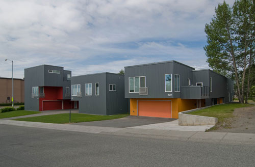
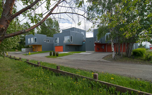
Just up the street is another stellar project, which employs an assertive geometry and, once again, a simple set of rules. When the steel envelope is notched a bright color is introduced, subsequently elements like entries and garages are clearly marked with the different colors. Overall, the form is simple and unencumbered. The inhabitants went straight for our hearts with their tidy lifestyles and modern deck furniture. An exhaustive search on the internet couldn’t identify the architect though, so give us a shout if you’re in the know.
Condominiums
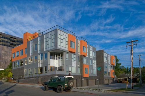
Down on the waterfront near Elderberry Park we found a sharp condominium project. We’ve always been fans of the stacked condominium skinnies and this example ratchets-up the concept with underground parking and roof-decks. Having some great props like a blue sky and a classic Land Rover out front doesn’t hurt either.
[All photos by BUILD LLC]
Follow our thoughts on Twitter and our location on Foursquare.
For more Modern List cities click here.


