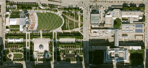
[Photo courtesy Google Earth]
Team BUILD just returned from Chicago where we toured some work that made our heads spin. Kudos to Chicago for being a city that understands and promotes Architecture with a capital A. While most of the work was very inspiring, two projects in particular really grabbed us. They represent extremely different philosophies and ideas in architecture, so for today’s post we thought we’d compare and contrast the two. We’re going to throw a whole bunch of BUILD opinion into the mix as well, so consume with a huge grain of salt.
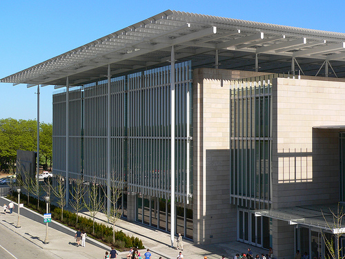
[Photo by pov_steve]
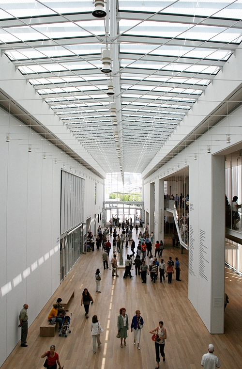
The addition at the Art Institute of Chicago by Renzo Piano Building Workshop exemplifies everything that is important to us about architecture and construction. The experience of the project was inspirational and the visit filled us with optimism about the future of design. The work got the blood pumping and the gears spinning for several reasons:
1. It’s functional: the circulation is straight-forward, the visuals contain everything that needs to be there and nothing else. The control of daylight has been engineered and used as a subtle design element.
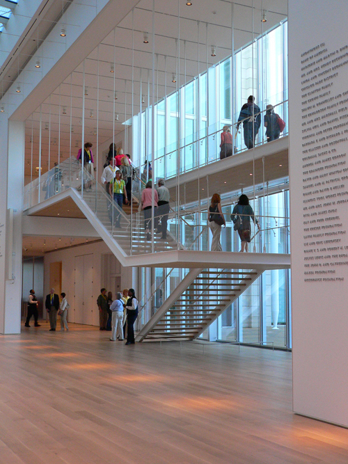
[Photo by pov_steve]
2. It’s rational: the architecture shows you what it’s doing; it looks like what it is. Connections between materials are revealed and detailed to look good.
3. It’s well composed: it’s not trying to make some huge design statement. It is pleasing to look at and the facades become harmonious backdrops to the street life. At night the glow of the glass walls provide visual warmth and welcomes visitors. Inside, the building allows the art to be the center of your attention.
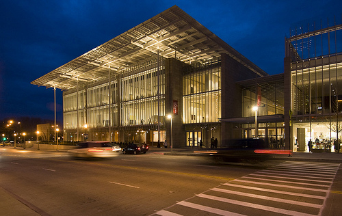
[Photo by jeklee]
4. It’s innovative: the lights are integrated with the ceiling trusses, the heating and cooling grills are inconspicuously tucked into reveals that line up with other architectural elements and nearly disappear, the main stairway is attenuated and crisp, the columns and beams are only as big as they need to be to do their job correctly, etc
[Photo by sidedown]
5. It’s warm: we found the wood floors and strategic use of cherry panels to be comforting and calming.
6. It’s interesting: the layers of structure and screening kept us captivated. The clear communication of structure causes us archi-geeks to think through the structure and assemble the building in our minds. It is a pleasing building to consider.
Stats:
Total square footage: 264,000
Square footage dedicated to gallery space: 65,000
Construction cost: $300M
Source: Huffington Post
[Photo by mattermatters]
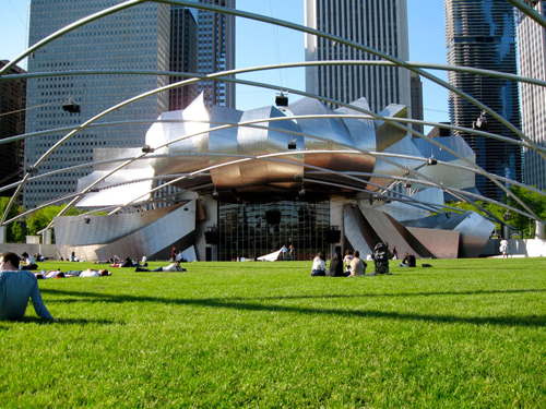
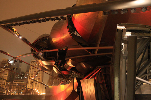
Across the street sits the Pritzker Pavilion designed by Gehry Partners. As a piece of architecture this work seems to represent much of what is misleading and elusive to us in the design world. Every time we looked around a corner of the building we scratched our heads and tried to prevent our minds from doing the math (structural-wise, cost-wise, sensibility-wise, etc). Chicago’s a serious architecture town, a town that has always demanded rigor from its architects and their work. It seems like Chicago commissioned a Frank Gehry building because everyone else had one and they needed it for their collection. It seems to us that Chicago could have done without this particular Gehry building for a few reasons:
1. It’s inauthentic: the curved forms seen from the amphitheater area have nothing to do with the actual structure of the building. Most of what is visible isn’t even the building, it’s just entourage. It’s hard to tell what the “building” actually looks like. This would be fine if it were a stage prop – but it’s not, it’s a building.
[Photo by dutch sheep]
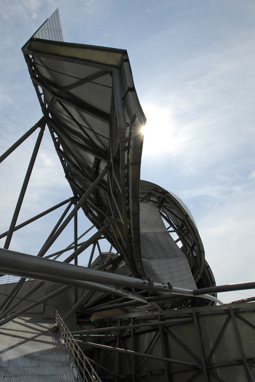
2. It’s irrational: the real structure of the building (behind the curved steel) is a mess. It doesn’t seem to have any order or rational thought put into it architecturally. Which is a shame because the team at Gehry Partners probably put an enormous amount of time into the design.
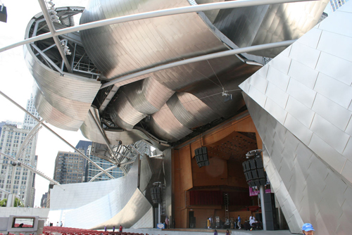
3. It’s playful: while the term has been used to compliment the building’s sense of fun we’re using it to criticize it’s lack of integrity. Playful is what kids are in a sandbox. To sideline rationale, sensibility and logic in lieu of playfulness on a 60 million dollar building seems reckless.
[Photo by dgphilli]
4. It’s unintegrated: it looks as though a big heap of clutter was put on the structural engineers desk to “figure out and make it work” rather than working with the structural engineers and integrating the disciplines.
5. It’s unintelligent: the building doesn’t seem to integrate the various systems together. It doesn’t seem to maximize the capabilities of materials and form, thereby consuming more resources and time. It’s clunky.
[Photo by uniblab]
6. It’s misleading: the project is giving people the impression that the most important ingredient to architecture is an artistic vision – regardless of what’s going on behind the scenes to make it work.
Stats:
Total square footage of amphitheater: 95,000
Square footage of Pritzker Pavilion: not available
Construction cost: $60M
Source: Wikipedia
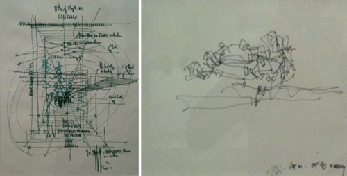
For us the difference between the two buildings is just as clearly illustrated in the initial concept sketches by each Architect. On the left is Renzo’s sketch for the Art Institute and on the Right is Gehry’s sketch for the Pritzker Pavilion
[Photos by BUILD LLC]


