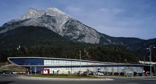
So there we were several weekends ago minding our own business looking through the New York Times Style Magazine when the “The Remix” section jumped out at us. The article highlighted Mpreis, Austria’s super-market chain. We were immediately fascinated because the Mpreis grocery stores are created with a design-forward aesthetic, are conscientious of their surroundings and each one is custom designed by internationally and locally renowned architects. The article suggested that while each of the 156 Mpreis stores is different, they all share a common design concept of being “light-filled pavilions” that “take full advantage of the dramatic mountain backdrops.” Apparently the family owned operation started taking architecture seriously in the early 1980’s. The Mpreis website even has a page dedicated to the architecture of their stores.
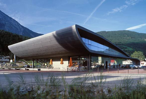
Despite the fact that we’re relatively well traveled, we just thought all super-market chains were designed like stucco covered shoe-boxes with cartoonish references to traditional architecture. But 15 minutes worth of research later and we uncovered a full range of beautifully designed and inspiring Mpreis grocery stores.
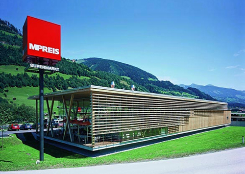
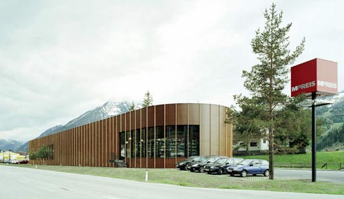
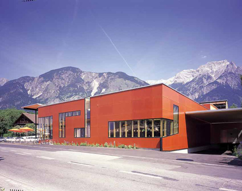
So just for fun we though we’d post some of the Mpreis stores along with some super-market examples from our own neighborhood. Now keep in mind, these Seattle examples are taken from an affluent, urban area. We rarely walk out of any of these stores without dropping a Benjamin – these are the cream of the crop grocery stores in the Northwest.
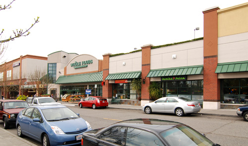
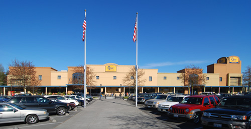
Here at BUILD, we think there is an extraordinary opening in the northwest for well designed grocery stores; we want our friends in the grocery business to embrace the opportunity that is simply lying dormant before us all. Food is taken very seriously here and Seattleites are known to pay for quality, sustainability and service. This is a clientele who is conscious of their environment, informed on the process of food production and intent on being healthy. Why would such a mentality relate exclusively to food and stop short of built-form and the design of our environment? Given the demographic, companies like Safeway, QFC, Whole Foods and Metropolitan Market have a unique opportunity to pull out in front of the pack and appeal to the design conscious population. Even the smallest gesture toward good design would seem light years ahead of their stucco box competitors. Good design will create a stronger brand name, a more dedicated following and a healthier built environment. We also think it could be entirely cost effective.
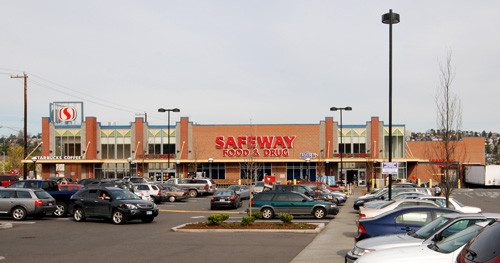
As part of the Raising the Bar series we’ve contacted the public affairs departments of each of the grocery stores listed above and have emailed a link to this post. We’re looking forward to hearing their feedback as well as yours.


