Each generation of architects seems to establish their own language of visual presentation. The crisp graphite lines and dramatic perspective drawings characterize the 50’s and 60’s. Bold water colors and loose geometries are reminiscent of the 70’s, the occasional clip-art guy with mustache and sports jacket thrown in for good measure. While these examples seem humorous and dated today they were the Hotty McHottersons of the time. Today’s blog entry is in pursuit of the current zeitgeist of visual language. You know us well enough by now to know that we’re not going to exhibit high-end presentations from the starchitects and mega-shops out there. We don’t think that it will be these enterprises that set the curve with their armies of lowly paid interns and exclusive modeling software. If you ask us, it will be the small shops in the trenches of practice and academia that will be most infectious with the new language because they have the same common denominators as the majority of us in terms of resources, staff & software; it’s just that they’re using these resources more intelligently and doing more with them. We’ve selected several groups that we’ve come across over the years and, in our opinion, they are forming the new visual protocol. The new language seems to be moving away from fashion, is taking on more analysis and is communicating more technical data. More important than the sexy imagery, it is the thinking behind these presentations that is generating the new language. Let us know who’s setting the curve for you…
KBAS Studio
Portland Thru-House

Cutting sections within a perspective drawing is a very intelligent use of modeling programs. The section cut is clearly indicated with the orange highlight and the interiors elevations have definition. This single image is communicating information traditionally accomplished with a perspective, a section cut and interior elevations.
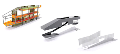
The image shows the efficiency of building a model once and getting multiple levels of information and imagery by turning on and off layers. Subtle shadows give the simple models a level of sophistication.
Palisades Glacier Mountain Hut

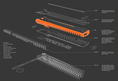
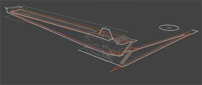
The drawing includes a dynamic element and explains the circulation.
John Szot
Coney Island Pavilion
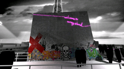
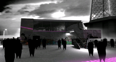
Using actual photos of graffiti as “decals” within the modeling program, the image achieves a gritty, urban feel. The series takes into account an aspect of urban weathering. Subtle lighting and ordinary weather conditions create a powerful presentation. The abstract people give a sense of scale and population without detracting from the rendering.
Saddle Creek
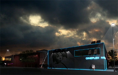
Living Smart Project

The imagery breaks the house apart like a piece of machinery.
Levin Residence
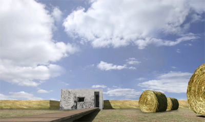
Tangible representations are created by embedding photographs into the model.
They have an excellent collection of graffiti and tags on their website.
SHoP
Portland Ariel Tram

The element of scale exists with the figures but the transparent shadow technique keeps the focus off the figures and on the architecture.
Lorcan O’Herlihy
Calarts Dormitory
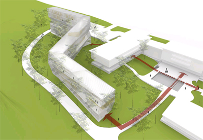
The landscaping is suggested but does not overwhelm the image. Site circulation and dynamics are added as a layer to the presentation.
Paulith
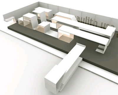
Subtlety of light and shadow give a tangible impression of how the space may feel.
Asymptote
166 Perry Street
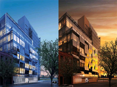
Using digital software to do what it does best – figuring out all of the intricacies and reflections of varying environmental conditions.
Penang Global City Center
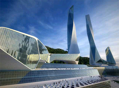
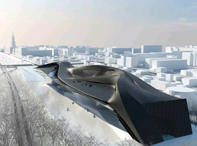
The display and comprehension of extremely complex geometries.
Jones Partners
Yucca Valley House
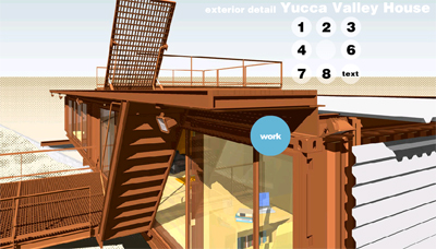
The use of extreme detail (even the lights have been precisely modeled) allows the rendering to serve as a form of quality control and troubleshooting for the finished work.
Preston Scott Cohen
Lightfall
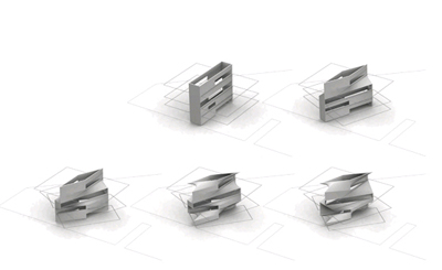
Communicating the process of design and allowing an observer (or more importantly a client) to understand the geometrical evolution of a design.
Public Arcade
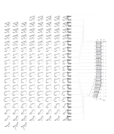
Presenting, comparing and contrasting variations/mutations of form.
Wu House
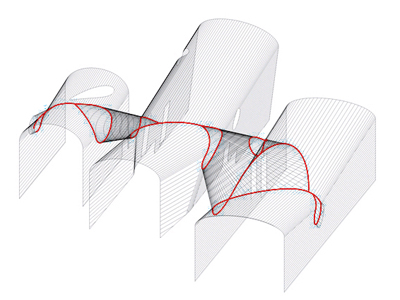
Clarifying and simplifying the complexities of hybrid geometries.
Neil M. Denari
Massey House

Merging renderings with construction documents the renderings start to become technical data which could be used as reference in the field.


