In designing, specifying, and building our projects we wade through a tremendous amount of crap out there on the internet. But for every 50 poorly composed, difficult to navigate, steaming pile of dog-doo sites out on the web there is always a gem or two. To track the countless trade related websites we’ve started keeping a Trade website matrix (25KB .PDF) which documents, among other things, a websites usability <read: we are design geeks>.

Today’s blog entry focuses on a handful of sites that have our attention and our business. While many suppliers and manufacturers sell clean, modern products we keep going back to these specific sites because they are well designed. Here are 6 key factors:
Effective interface: easy to understand and navigate
Pleasing aesthetics: professional photographs and composed pages
Respectful use of the viewer’s time: take us straight to the data
Thorough information: all products and options presented & organized
Useful data: downloadable specs, AutoCAD files, dimension sheets
Search options: different methods to find what we’re looking for
Best Website: McMaster Carr
This site is phenomenal – it displays tens of thousands of products and does so with a direct and understandable interface.

A similar graphic style is used for all product illustrations, which makes the site pleasing to navigate; even items as insignificant as screws have multiple illustrations and diagrams to help you choose exactly what you’re looking for.

The McMaster Carr website gets the BUILD gold star of uber-greatness. They also ship most of their products same day so that you get it very quickly.

Best Kitchen + Bathroom website: Kohler

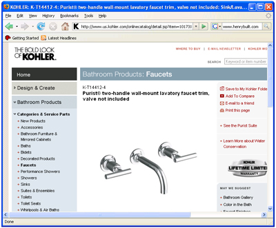
All fixture models are shown with their respective options and they provide a thorough list of downloadable technical information. Inspiring photography along with good data makes the experience of selecting plumbing fixtures more enjoyable. There can be a bit too much going on in the page the further you get into the products but the site is straight-forwards and clean.
Best brand lighting website: Louis Poulsen

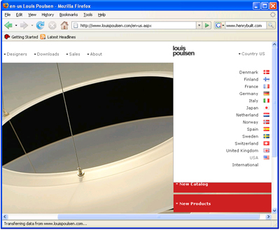
The site includes pleasing photography that represents the products nicely and provides downloadable technical spec sheets in .PDF format. It is NOT necessary to create an account or login to search the product. We find the site to be a bit over-designed but once you figure out the navigation it makes sense
Best conglomerate lighting website: 100watt

A thorough collection of lights combined with effective search options gets you to where you’re going quickly. The search does NOT require a login or membership. Lights are accompanied by drawings with dimensions and there are downloadable technical spec sheets in .PDF format for some products.
Best cabinet website: Henrybuilt

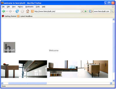
The site is graphically clean and composed with high-end photographs. There are no gratuitous intro film clips, which is rare for cabinet websites. They provide downloadable technical spec sheets in .PDF format for clients (login required).
Best hardware website: Omnia

Clean, organized photos of door knobs allow you to navigate quickly to specific products and downloadable data. The relevant options are shown where applicable.
Post your favs…


