A simple definition of “construction documents” could be – graphic instructions which show how physical things go together. In architecture the standard form of construction documents is the two-dimensional black and white line drawings, printed on large sheets and bound together. While these documents are the industry standard and are a powerful tool, the concept is beginning to seem outmoded given the sophistication of three-dimensional digital rendering, the integration among software, and the general sophistication of modern built form.
Today’s blog entry looks at other industries and reviews different methods of graphic communication. In addition to developing a catalog of methods, we also hope to spark some potential ideas applicable to architectural construction documents. Let us know of other examples out there.
TOYS
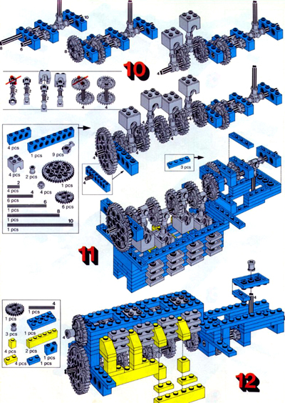
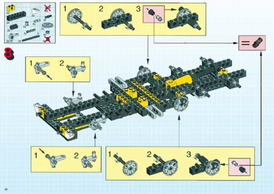
LEGO instruction books include exploded color axons with supplementary details of the kit-of-parts and pre-assemblies. The step by step assemblies are an excellent example of clear graphic communication.
For an amazing collection of LEGO instruction books visit this website.
UTILITIES
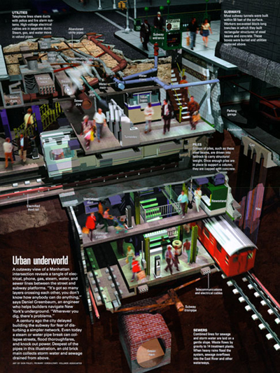
National Geographic published a series of diagrams identifying the layers of utilities under Manhattan. These high resolution renderings have a life-like quality and are technically correct with dimensions and relationship of scale.

Plumbing diagrams often use color and spatial dimension to clarify what would otherwise be complicated beyond comprehension.

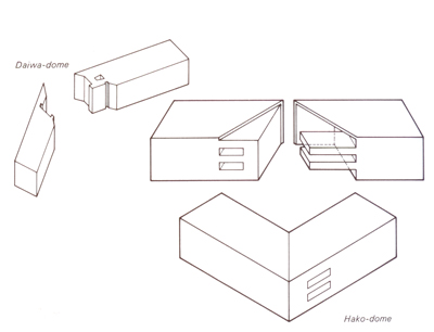
JAPANESE JOINERY
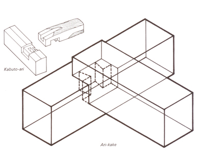
The simple axonometric drawings at just the right angle allow the viewer to entirely understand multiple objects and their relationship to one another. Diagrams from the book The Art of Japanese Joinery.
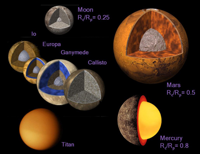
PLANETARY PHYSICS
High resolution cut-away renderings with color coding.
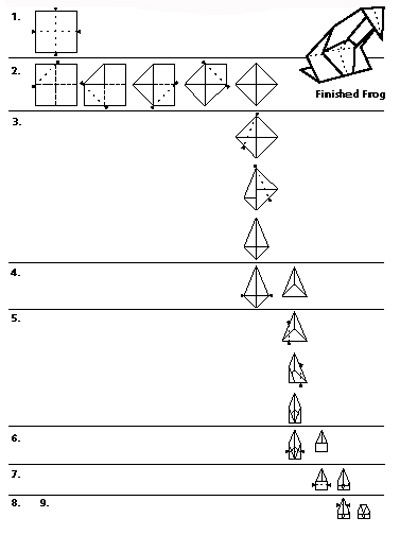
ORAGAMI
The process of construction is broken into graphic groups for the 9 different phases.
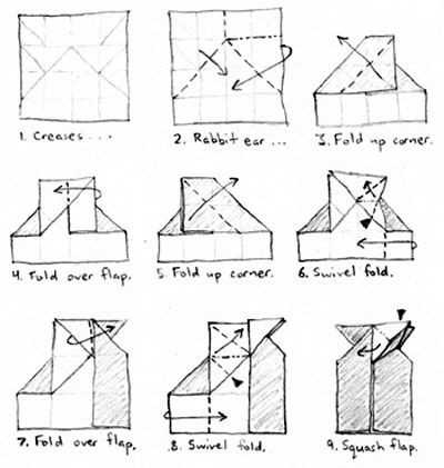
Directional arrows, brief notes and sketched shading provide a clear path to a finished product.
BOATS
The rendering with selective cut-away areas gives the viewer a good idea of the exterior and some of the inner workings of the ship

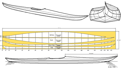
Both the bow and stern of the kayak are shown side by side for geometrical comparison. Perspective, elevations and plan are all on the same page for clarity.
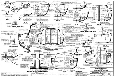
Details are broken out adjacent to the section cuts
AIRPLANES
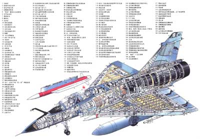
The complete transparency of the shell allows the viewer to see the inner workings but still have a concept of the overall geometry of the aircraft.
CLOTHING
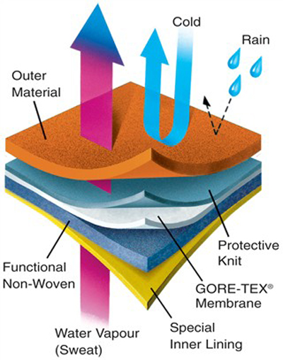
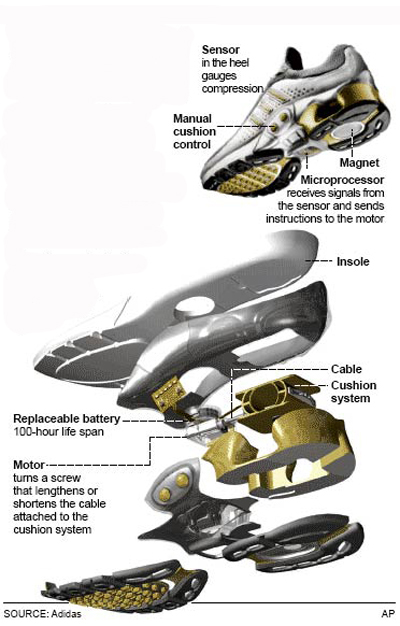
The partially exploded perspective also includes diagramming of the fabrics function.
A sophisticated digital model allows for high resolution exploded axons of complicated geometries.
TRANSPORTATION
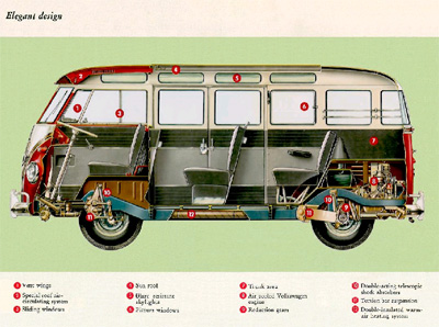
Varying degrees of transparency give the viewer a good idea of the exterior and a basic understanding of the interior.

The color cross-section helps differentiate materials while the identification key covers the technical information.
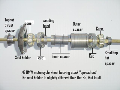
An actual photograph of the assembly is labeled to produce this diagram.
FIREARMS
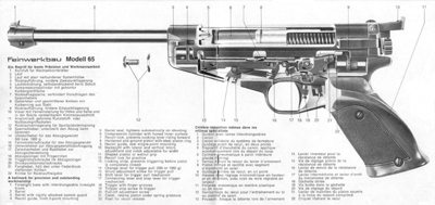
Selective cross sections show areas of most important detail.
ELECTRONICS
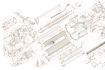
Exploded axon with part labels of an IBM Series III copier. This and other diagrams can be found in Tufte’s series of books on visual communications
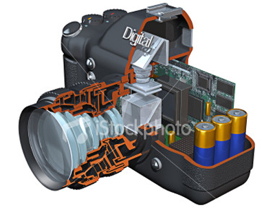
Selective cross section cut indicates areas of detail, highlighting the complexity of the lens construction.
THE HUMAN BODY
Models and renderings of complex geometries allow for an understanding of the human organs. Detail boxes add supplementary information to key areas. Diagrams from The Complete Portfolio of Human Anatomy and Pathology from Scientific Publishing Ltd.
