Each spring we receive an abundance of architectural portfolios, supplemented with resumés, from students eager to secure a summer internship. These portfolios come from all over the world and exhibit a wide range of abilities and design philosophies. While we always enjoy seeing the diversity of design and presentation skills offered by the future architects of the world, diversity isn’t actually what makes the greatest impact when we review a portfolio. The funny thing is, the more variety we see with the presentation of portfolios, the more we rely on a simple and consistent set of guidelines to determine a candidate’s aptitude. These guidelines are timeless, they relate to our own student portfolios (pre-Photoshop) just as they do to today’s highly digitized portfolios. They span all mediums and pertain to physical and digital portfolios alike. They are universal and apply equally from Arkansas to Zimbabwe, and from the university level to professional internships.
This is typically the part where we’d tell you that this is just our perspective and that you should take it with a grain of salt; that if you get 10 architects in a room, you’ll get 11 perspectives and so on. But that’s not really the case with this particular topic. The 5 guidelines below were gleaned from our experiences in undergraduate school, graduate school, working for architects and, eventually, running our own shop. Some of these guidelines were handed down to us by the individuals that decide whether or not you’ll get into the graduate school of your preference, others are the convictions of the architectural collective mind. At the very least, every architecture student should consider these 5 guidelines when preparing their portfolio.

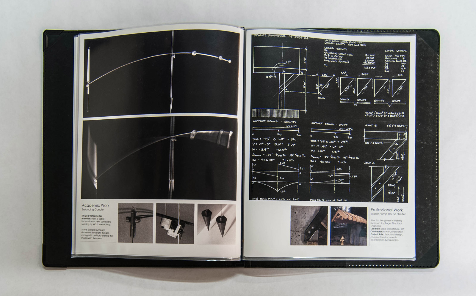
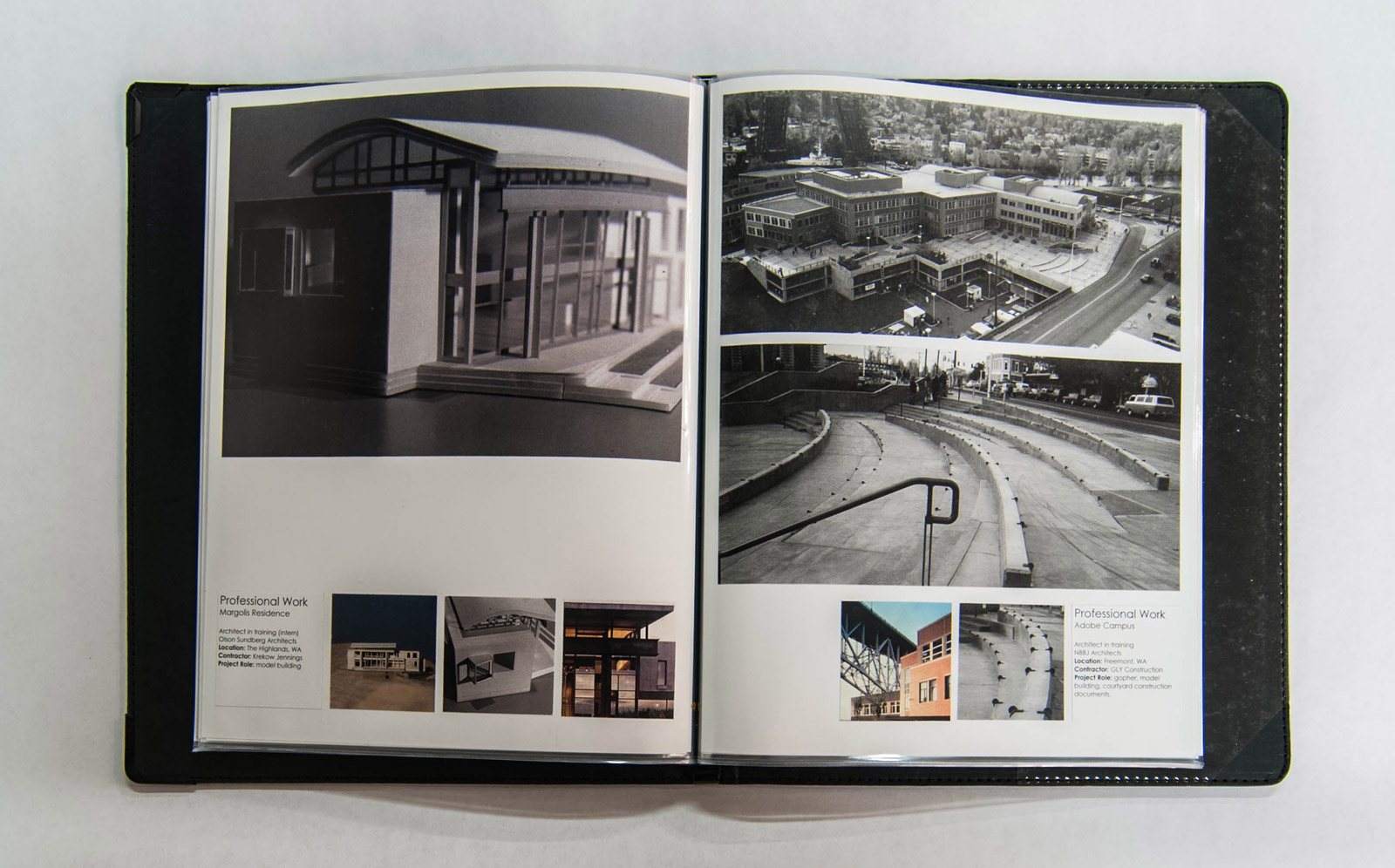
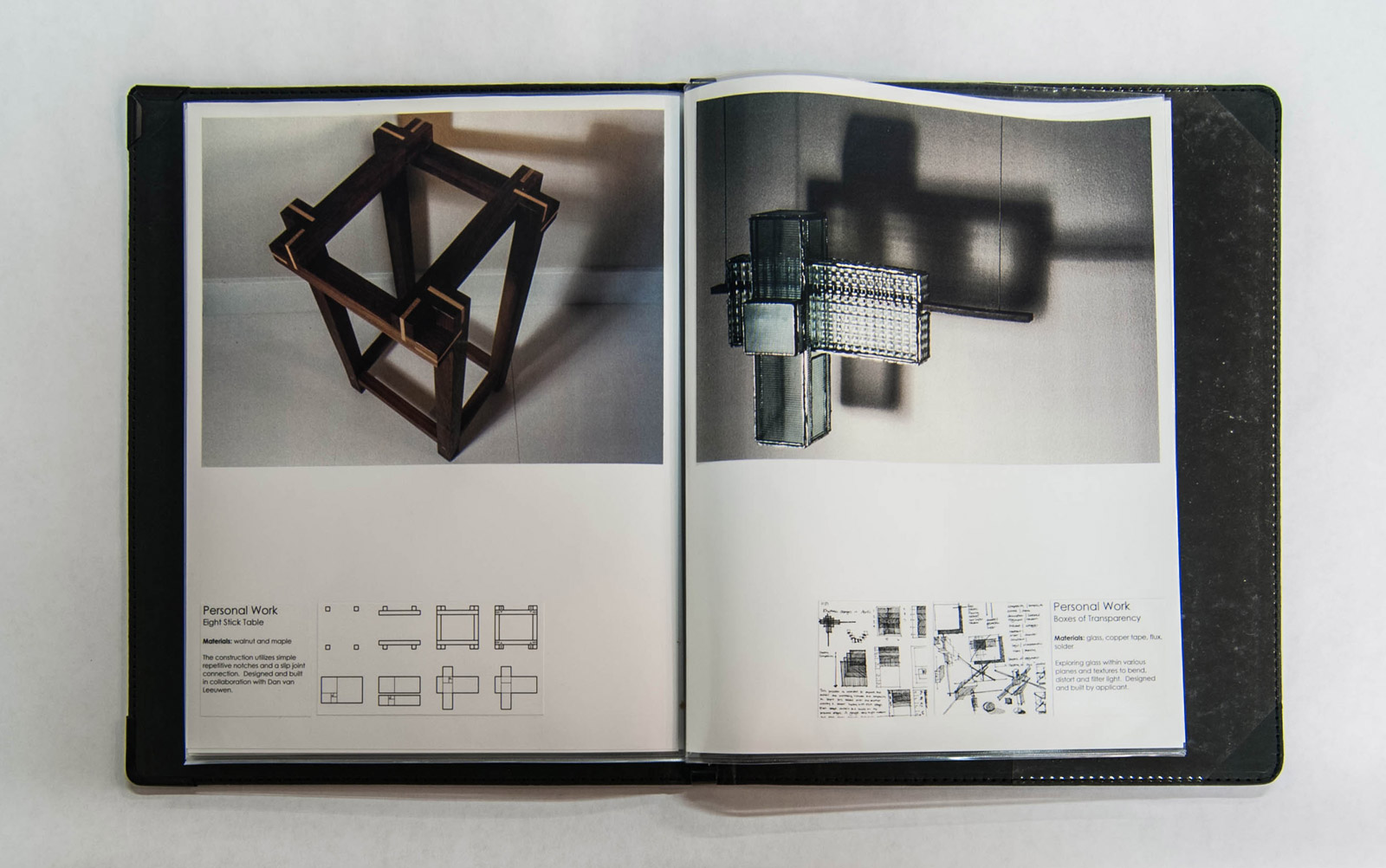
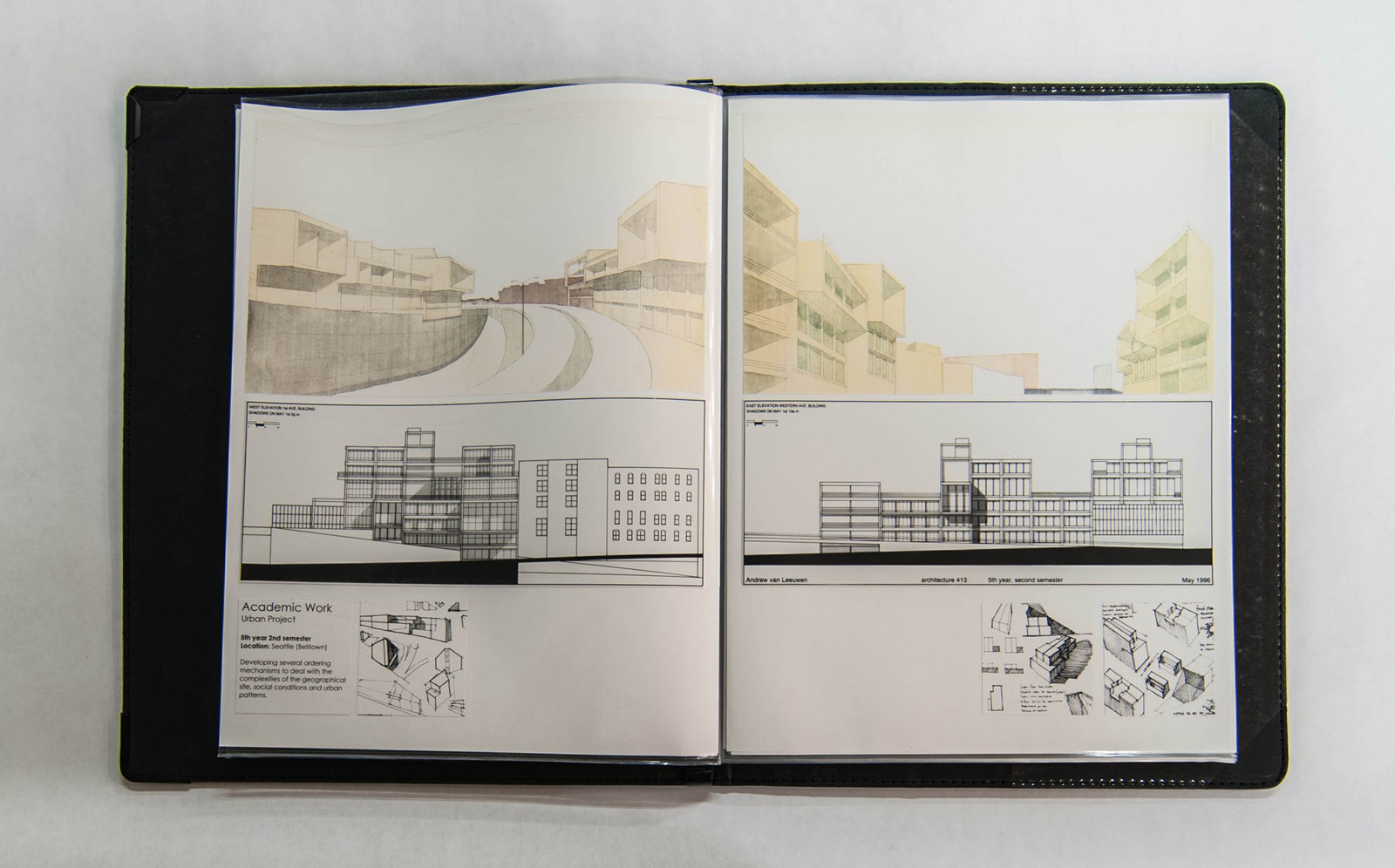
The visuals for this post were pulled from one of our own portfolios, and although this example is practically ancient now (it was completed when camera’s still used film!) it serves the conversation well. The same guidelines applied to this portfolio just as they do with the portfolios we get every day, hot off the press.
1. Don’t overthink the packaging. Whether it’s the binding form-factor for a physical portfolio or the choice of presentation templates for an online portfolio, simple and straight-forward is typically more effective than overly creative attempts. If you’ve got a clever idea, by all means, use it, but don’t concoct something just for the sake of being different at the expense of clarity and accuracy. Remember, it’s the work inside the portfolio that is the focus, the binder or website is simply the vehicle.
For physical portfolios, there’s nothing that beats the attenuation of the plain and simple Profolio by Itoya or, for something nicer, our favorite is the Prat Paris 112 Rod Binder in black leather.
For online presentations, we like the Squarespace templates because they allow for simple navigation and full screen images. There’s a wealth of similar templates out there for free.
For digital portfolios that can be emailed, PDFs books are the way to go, but be respectful of an architect’s time and inbox limitations by keeping the memory reasonable (less than 10MB please).

2. The Rule of Thirds. A portfolio is the summary of your life’s design accomplishments, it should show the best examples from three primary aspects of your architectural endeavors:
1/3rd ACADEMIC WORK: filling a third of your portfolio with inspirational student work should be a no-brainer. If this presents a challenge, might we recommend switching to another school.
1/3rd PROFESSIONAL WORK: get an internship with a good architecture firm as soon as you can. Even if it’s just for a week or two during winter break, it will give you a chance to include real world projects in your portfolio with reference to a professional architecture firm. Work on everything you can get your hands on during an internship and diligently document your work.
1/3rd PERSONAL WORK: it’s important that your portfolio demonstrate that you’ve got personality, that you’re up to engaging activities, and that your involvement in design extends beyond 9am to 5pm. Maybe your personal work highlights travel experience to reveal your worldly adventures or maybe it covers built side-projects to demonstrate that you know how to get your hands dirty. Design firms and graduate schools all want go-getters with personality.

3. Big images, little text. Ready for some shocking news? Nobody is going to read your portfolio. Now take a deep breath and be at peace with this fact. Keep the text minimal and include only the facts: the project type, studio or professor, year, medium, materials or techniques.

4. Drawing and sketching by hand will always be essential. Glossy high-end renderings are great, and if you can do them well, you should definitely include them in your portfolio. But there’s an unwritten understanding among architects that anyone who designs should know how to sketch with competence. This speaks not only to the handwork of sketching but of the social and communication skills which are a necessity in architecture. It also shows other architects how you think. Find opportunities to include sketching into your portfolio even if it’s just process sketches to support other documents. A portfolio without sketches or hand drawings isn’t an architecture portfolio — it’s a rendering portfolio.

5. Maintain a consistent format. A design portfolio should create a narrative that deliberately weaves your best projects together into one cohesive presentation. There should be a common geometry or system of visual rules that carries from one page to the next. A successful format can take disparate projects from separate periods of your academic career and relate them to the same storyline. And don’t be afraid of blank space; it shows confidence that the images you choose to show are important. Plus a bit of blank space enhances the geometric format of the portfolio.

There are probably a few more guidelines that should be considered when creating a design portfolio but these 5 have stood the test of time better than any others. Each time a portfolio arrives at the BUILD World Headquarters, it is these 5 guidelines that differentiate the successful portfolios from the mediocre submissions.
Oh, there’s one more thing, and this one is entirely opinion. At the end of the day, just remember that your portfolio isn’t the Holy Grail. You’ll put sweat, blood, and tears into your portfolio and for a brief moment in time it may seem like the most important document on the face of the earth. Your portfolio will be one of your greatest assets as a designer and it may very well be the tipping point to getting into that incredible graduate program or landing an internship with that amazing firm. But someday, closer than you may realize, you’ll find your portfolio collecting dust under a stack old design magazines. And if you followed the rules above, and your portfolio got you where you wanted to go, you can leave it right there.

Cheers from Team BUILD


