
A couple of years ago we launched the BUILD LLC website; it was updated with all of our latest projects, a new format, and a different philosophy of website design. Since then, we’ve had a decent amount of time to watch the site, track the metrics, and determine its effectiveness on our business. This scrutiny has led to some important discoveries on the nature of website design in relation to an architecture practice; here are our top 5 ingredients of a great website for architects:
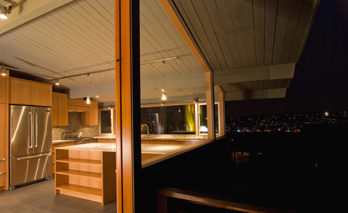
1. The site shouldn’t be designed for “architecture”; it should be designed for photographs. Maybe the photographs are of architecture, design, furniture or whatever else, but the basic building block of the website is the photograph. As basic as this sounds, it’s a different filter to put on that allows you to understand website design with better clarity.
2. Big, inspiring images are more important than text. Naturally you need to include a bit of explanation with each project, but it’s rarely the text that gets people inspired to pick up the phone and call us, meanwhile the images are almost always praised by new clients. Don’t let the text get in the way of a good photo.
3. A simple, clear interface is essential. We’re always amazed at how often architects try and re-invent website interface design (stick to doing architecture!)
4. Being able to update the website ourselves is key. As architects and builders, having control over the final product is very important to us –we can’t imagine sending a bunch of files to a website tech to manage the updates for us. We like to turn those dials ourselves.
5. It’s got to be cost-effective. Our social media extensions need to reflect our own values with architecture and design.
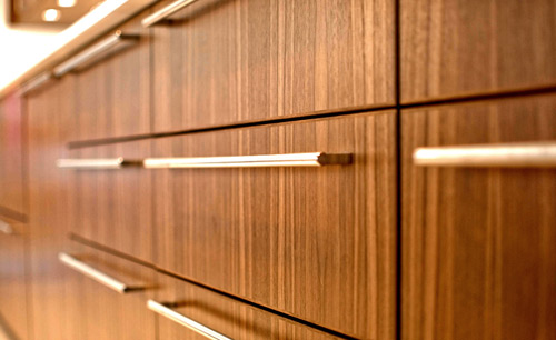
The BUILD LLC website has been doing quite well, meeting the criteria above and bringing in a ton of new business. So when we looked at recently launching a website for our cabinet and furniture shop, Special Projects Division, it was a no-brainer to go the same route. We called up our friends at liveBooks and they got crackin on a template site for SPD. We’re big fans of website templates because they standardize interface design and allow the architect to make updates without having to learn ridiculously complex code.
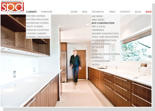
The challenge with the new SPD website was to present both the cabinet series as well as all of the furniture pieces we design and build –two very different avenues of the cabinet shop. At the same time the technicalities need to be covered as well as additional categories that handle press, contact info and all that good stuff. The template we chose uses a set of simple rules that remain the same throughout the entire experience; a consistent navigation at the header, wide photos at the top and text blocks on the bottom -simple and straight-forward. Navigation titles that handle a variety of categories have pull downs to keep the basic navigation clean and unencumbered.
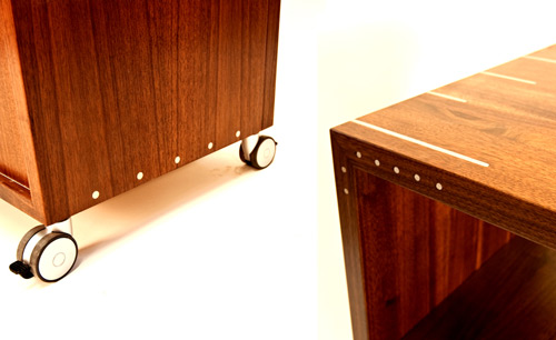
Websites should be inspiring, simple to navigate and up to date with current work. All too often we see architects defeated by their own design instinct to either over-design or re-invent website interface -leaving them with clunky websites that rarely get updated.
In our continuing effort to save the world from ugly and be transparent at the same time, we thought we’d get some good resources out there –the resources that have worked well for us. If you’re looking for some solid website guidance, give the hardworking folks over at liveBooks a shout. For sleek, effective branding and logo design look up Bill Reilly Design. And for some serious photography skills, check out our resource list for architectural photographers.
Cheers from team BUILD


