Not long ago, we stopped sending our clients to tile showrooms. Tile showrooms have become entirely overwhelming to the point of leaving a visitor exhausted, confused and dizzy. As far as we can tell, the business model that most tile showrooms operate under is this; carry and display every type, style, size and color of tile known to humanity, so that when a homeowner visits the showroom they are put into immediate decision paralysis. While the tile industry may believe that more options equate to a better design experience and a higher quality finished product, we disagree. To us, modernism is all about filtering information so that you’re left with an organized set of comprehendible decisions. The design process should be enjoyable, rational and sensible. As we covered in a past post, more choice does not necessarily lead to greater happiness.
So over the years we’ve rounded up a handful of tile options that work well for our cost-effective modern projects. Of course, manufacturers discontinue some (and release other) options, suppliers change what’s available, and the world is full of change. So in response, here is our guideline on selecting tile along with some previous selections we’ve used.
Here are some key characteristics of tiles we use:
![]() They are conventional; they come in typical sizes and are consistent between one order and the next. They are straight-forward to work with and our tile sub-contractors are familiar with them. Bespoke, hand-crafted tiles made by artisans are unpredictable and can introduce undesirable variables to the equation -these variables very rarely cost less or speed up a project timeline.
They are conventional; they come in typical sizes and are consistent between one order and the next. They are straight-forward to work with and our tile sub-contractors are familiar with them. Bespoke, hand-crafted tiles made by artisans are unpredictable and can introduce undesirable variables to the equation -these variables very rarely cost less or speed up a project timeline.
![]() They are available nationally; exotic tiles from far-off lands have long lead times and it can be very difficult to order more later. Let’s face it, all the careful planning and over-ordering in the world can never remove the variable of potentially needing more.
They are available nationally; exotic tiles from far-off lands have long lead times and it can be very difficult to order more later. Let’s face it, all the careful planning and over-ordering in the world can never remove the variable of potentially needing more.
![]() These tiles avoid fashion; given that tile work is a relatively permanent feature in a home, it always amazes us how trendy tile design has become. While it’s tough to predict what will be timeless in 10, 20, 50 years, our money is on these tiles.
These tiles avoid fashion; given that tile work is a relatively permanent feature in a home, it always amazes us how trendy tile design has become. While it’s tough to predict what will be timeless in 10, 20, 50 years, our money is on these tiles.
![]() They are not decorative; these tiles have a function (namely to be durable and keep the water contained) and they create a visual backdrop rather than making a pattern, design feature or focal point.
They are not decorative; these tiles have a function (namely to be durable and keep the water contained) and they create a visual backdrop rather than making a pattern, design feature or focal point.
![]() They are bigger; all tile is a bit inconsistent – it’s simply the nature of a ceramic kiln fired product, or stone or other similar material. These inconsistencies may only be 1/32” for an individual tile, but these fluctuations add up over the tile courses. Although larger tiles provide a crisp, modern aesthetic, they too can be inconsistent and imperfect- this imperfection must be embraced or everyone will just be unhappy in the end.
They are bigger; all tile is a bit inconsistent – it’s simply the nature of a ceramic kiln fired product, or stone or other similar material. These inconsistencies may only be 1/32” for an individual tile, but these fluctuations add up over the tile courses. Although larger tiles provide a crisp, modern aesthetic, they too can be inconsistent and imperfect- this imperfection must be embraced or everyone will just be unhappy in the end.
Occasionally, we’ll work with a homeowner that has their heart set on a tile that doesn’t meet the criteria above. And that’s perfectly fine – the important part is that the homeowner knows what they like and that they’re not overwhelmed by design options. We can usually work in a few areas of special tile given a few disclaimers in relation to the points mentioned above.
Given the above criteria, we’re laying down our top 5 tile recommendations for today’s post. Some of these are tiles that we’ve found ourselves, some are tiles that our research savvy clients have tracked down and some are recommendations from other design professionals that we’ve adopted. They’re all great tiles and you’ll continue to see them used in our future projects.
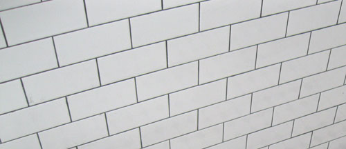
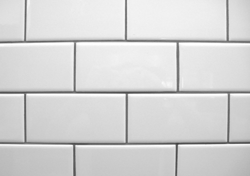
![]() White subway tiles in a matte finish. There’s reason that it shows up in most Parisian subways –it’s timeless. . It’s also an inexpensive product and relatively simple to install. While the dimensions of subway tile can vary, the common proportion is a width that’s twice the height. For a more modern look, the tiles can be organized in a grid (rather than staggered). Dal Tile makes a nice “Matte Arctic White” 4 ¼” x 8 ½” subway tile in their “Modern Dimensions” line #0790.
White subway tiles in a matte finish. There’s reason that it shows up in most Parisian subways –it’s timeless. . It’s also an inexpensive product and relatively simple to install. While the dimensions of subway tile can vary, the common proportion is a width that’s twice the height. For a more modern look, the tiles can be organized in a grid (rather than staggered). Dal Tile makes a nice “Matte Arctic White” 4 ¼” x 8 ½” subway tile in their “Modern Dimensions” line #0790.
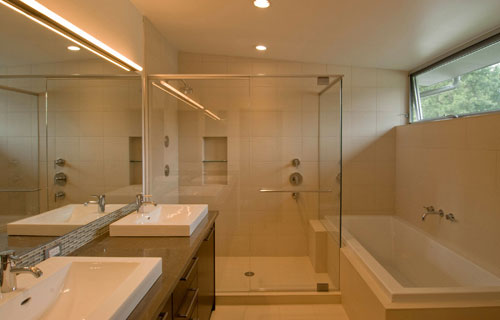
 Pental Porcelain Studio collection, 12” x 24”. We like the simplicity of this collection and the reasonable price point. Our favorite color is the beige which is dark enough to conceal footprints but light enough to keep a room bright.

[Queen Anne Residence by BUILD LLC, photo by BUILD LLC]
![]() Home Design, Rectified, Vaniglia Plain, 12” x 12” & 12” x 24”. The large tiles are ideal for a subtle wall backdrops where we want items like the bathroom fixtures to be prominent design features.
Home Design, Rectified, Vaniglia Plain, 12” x 12” & 12” x 24”. The large tiles are ideal for a subtle wall backdrops where we want items like the bathroom fixtures to be prominent design features.
[Davidson Residence by BUILD LLC, photo by BUILD LLC]
![]() Pental Porcelain Feel, 12” x 24”. The tile has a slight texture which warms up the space without exaggerating the tile itself. In the application below we’ve cut the tile panels down to 6” x 24” to contrast with the 12” x 24” floor tiles.
Pental Porcelain Feel, 12” x 24”. The tile has a slight texture which warms up the space without exaggerating the tile itself. In the application below we’ve cut the tile panels down to 6” x 24” to contrast with the 12” x 24” floor tiles.
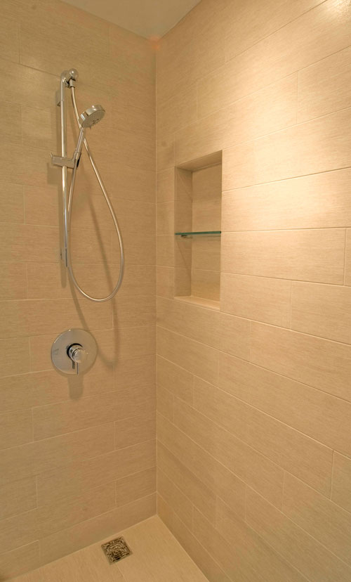
[Innis Arden Residence by BUILD LLC, photo by BUILD LLC]
![]() Pental English Bay, 12” x 24”. This is a great floor tile. It lets the cabinets pop out and the tiles are still dark enough that you don’t have to mop up every time your kids walk through the kitchen.
Pental English Bay, 12” x 24”. This is a great floor tile. It lets the cabinets pop out and the tiles are still dark enough that you don’t have to mop up every time your kids walk through the kitchen.
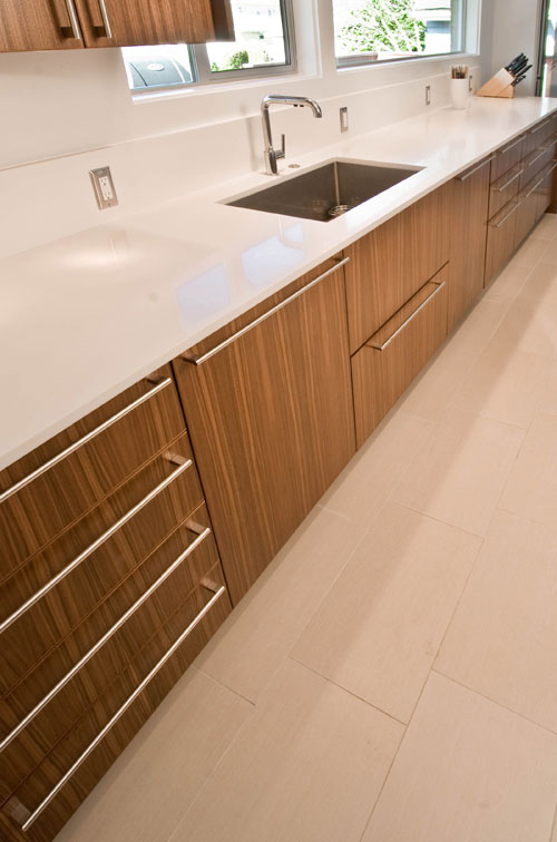
[Vail Residence by BUILD LLC, photo by BUILD LLC]
As with anything about design and construction, selecting the right material gets you most of the way there, using the right methods of install are very important and will dial in the modernism. Here’s our top 5 general notes on working with tile:
![]() In general, we encourage our clients to select tile that is larger, minimizing grout joints which are the primary area of maintenance in a wet room, particularly on a floor.
In general, we encourage our clients to select tile that is larger, minimizing grout joints which are the primary area of maintenance in a wet room, particularly on a floor.
![]() The room’s proportions and general size play a crucial role in sizing tile. Although there are a host of considerations here, we find that using larger tile typically works as long as the room isn’t very small. In smaller spaces, downsizing the scale of the tile can help make a room feel larger. And, on the topic of smaller rooms, we’ve also found that tiling the entire room (to the ceiling) can help make the room feel more spacious.
The room’s proportions and general size play a crucial role in sizing tile. Although there are a host of considerations here, we find that using larger tile typically works as long as the room isn’t very small. In smaller spaces, downsizing the scale of the tile can help make a room feel larger. And, on the topic of smaller rooms, we’ve also found that tiling the entire room (to the ceiling) can help make the room feel more spacious.
![]() At a shower application, draining to a trough keeps the tiles to their full size, rather than the angled cuts that so often complicate the look of a tiled floor. More info and details in our previous blog post here.
At a shower application, draining to a trough keeps the tiles to their full size, rather than the angled cuts that so often complicate the look of a tiled floor. More info and details in our previous blog post here.
![]() If draining to a trough isn’t possible, use a small tile that is similar to the floor tile so that the sloping pan can fold cleanly into the drain.
If draining to a trough isn’t possible, use a small tile that is similar to the floor tile so that the sloping pan can fold cleanly into the drain.
![]() For large floor tiles: When using these tiles on floors, we’ve found that it looks best to stagger the courses, on approximately 1/4 intervals, to provide a subtle detail and intentionally *not* line joints up in a grid. ¼ spacing is better than splitting in the middle since larger tile tends to have a little bow in its shape and can accentuate any discrepancies in heights between adjacent tile edges.
For large floor tiles: When using these tiles on floors, we’ve found that it looks best to stagger the courses, on approximately 1/4 intervals, to provide a subtle detail and intentionally *not* line joints up in a grid. ¼ spacing is better than splitting in the middle since larger tile tends to have a little bow in its shape and can accentuate any discrepancies in heights between adjacent tile edges.
There you have it, everything we like about tile and quite a bit of what we spec in tile design.


