Part two of Couch Cushion Architecture expands on the known collection of significant couch cushion projects in the western hemisphere and continues the discourse. As with part 1 of the study, the basic DNA of design logic can be observed in these works. At the root of any great designer lies a strong connection to the fundamentals of couch cushion design and construction.

A simple geometry and clear orthogonal moves allow this project to be a three-dimensional extension of Mondrian’s thesis. We admire the subdued palette of materials and ambitious structural cantilever. The nebulous entry, however, confuses the approach and subtracts from the compositional success. Grade: C+

An ambitious architectural statement, this structure takes its design queues from middle-east cave dwellings. The calculated addition of bold colors and rich textures softens the eye and puts one at ease despite the unknown variables in its structural system. Grade: B
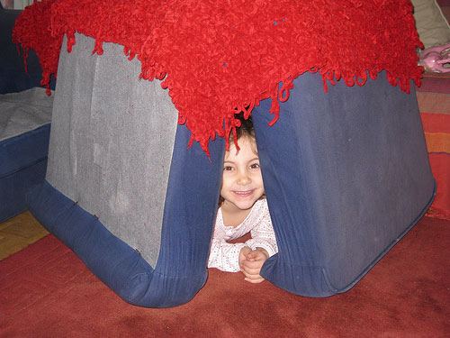
The A-frame’s sound structural properties and ease of construction have long since proven their architectural merits. We applaud the use of red shag carpet as a departure from what would otherwise be a mere pedestrian form. Grade: B+
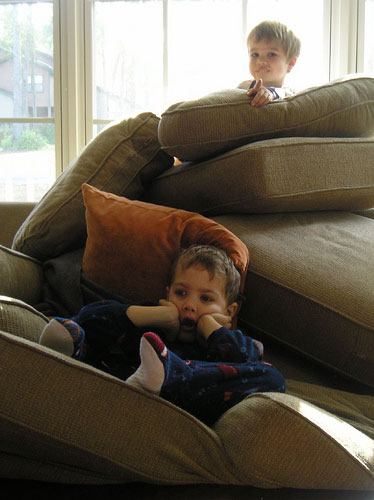
While typically the stacked foundation technique leads to a stable and impressive base, this particular application seems dubious. Fraught with apparent labor strikes the project is rumored to have developed irreconcilable technical inadequacies and unresolved scheduling conflicts. Grade: D-
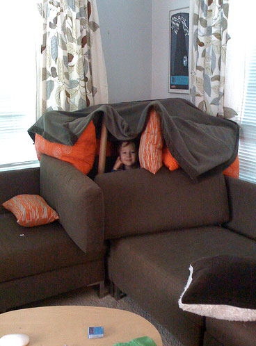
The clear reference to pole barn framing resonates with us and we found amusement in the tongue-in-cheek dual structural system. The clever siting of the project is finished nicely with a deliberately draped, light-weight roof structure. A warm, modern color palette gives the project a handsome and approachable street front. Grade: A+
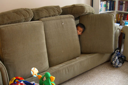
Drawing from the saw-tooth roof structures of industrial Europe, the orthogonal volume cleverly employs a swing hinge access door, popularized by the mid-century modern masters. Grade: B+
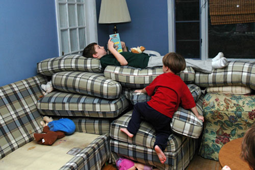
This whimsical project draws inspiration from the classic Tuscan stone towers of Italy; where a taller tower symbolized an owner’s power and prosperity over neighboring structures. Unfortunately the design falls short of greatness with its lackadaisical cushion placement and poor choice of plaid. Grade: C
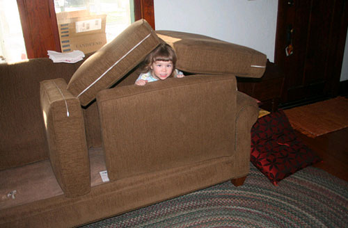
Employing a northwest gable frame vocabulary, this structure initially impressed us with its optimal function per structure ratio. Unfortunate structural failures have since played a role in the demise of this particular project. Grade: C-
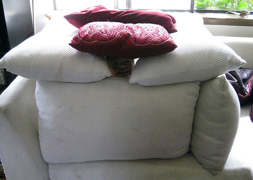
Although we’ve never been the post-modern movement’s biggest fans, the project is well planned and structurally efficient. Roof caps allow for natural ventilation and at the same time provide a deliberate change to the color palette. Grade: B
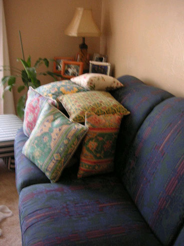
The project treads lightly on the land and gains enormous respect as a piece of true sustainable couch cushion architecture. Surprisingly, the minimal structure provides accommodations for a lone inhabitant. Grade: B
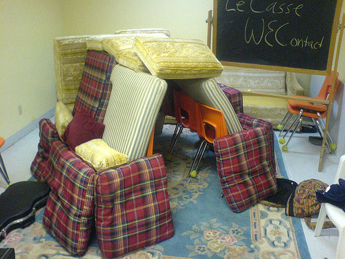
A rare example of cathedral buttressing, this project also employs a heavy medieval base. The interior incorporates a steel frame and establishes a “belt and suspenders” structural system. Technicalities aside, the project suffers from an inconsistent material palette attributed to coordination issues with the supplier. Grade A-
For more design talk and general tomfoolery follow us on Twitter.


