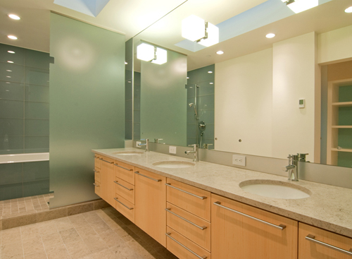
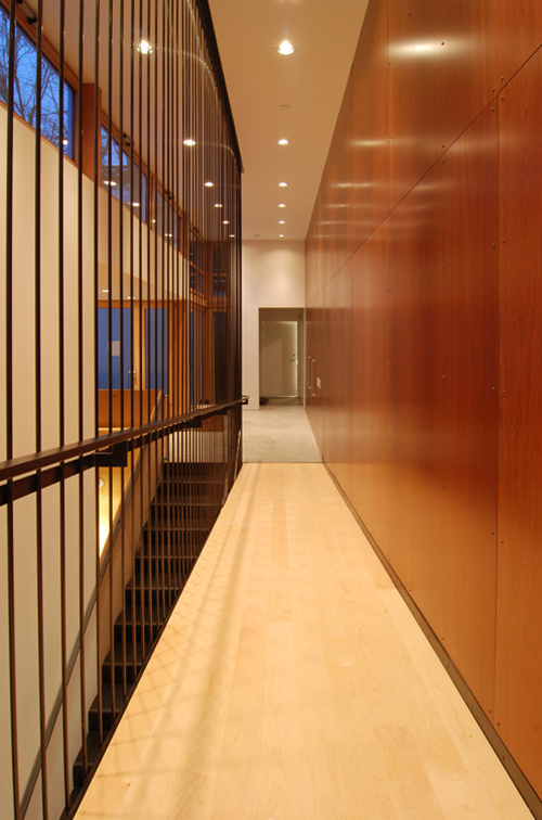
Many of you that follow along with the BUILDblog know that, as an architecture firm, we started taking our own project completion photos a couple of years ago. In addition to it being liberating, exciting and informing, we’ve noticed that it has also caused us to take a stance on the philosophy of the architectural photograph. You might be surprised to hear that the architectural photo is not necessarily factual; it’s not always a recording of exactly what is on site. Architectural photos do maintain a documentary nature of course, but just as important, the photo conveys how the space is experienced and how the space feels. For today’s post, we’re going to highlight a recently completed cabinet package from our cabinet shop to illustrate our top 10 technical tips behind our philosophy of the architectural photo. The project includes approximately 7,500 square feet of finished cabinet and wall panel surface; subsequently there is a wide range of conditions and an infinite amount of shots and angles.
#1 Get completion photos as soon as you humanly can. This isn’t so much philosophy as much as strategy to ensure that you’ve got photos to have a philosophy about. On this project we had a 2 hour window between the General Contractor’s completion and the owners moving in. If we had more time, would we have taken the photos differently? – of course, but you work quickly and get what you can without being a nuisance to the builder or the owners. Quick and dirty photos are better than no photos.
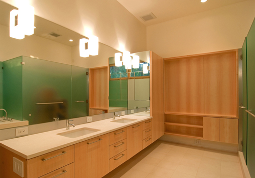
#2 The photographer and the gear should not have a cameo appearance in the finished image. It’s a tough one when it comes to mirrors; the photo above shows the finished shot of a bathroom flanked in mirrors. The shot below shows the original photograph exposing the camera and tripod in the reflection. Taking the camera out deviates from true factual photography but leaving the camera in distracts from the architecture. We use a remote control for the shutter to remove the photographer from the reflection and do the remaining removal in Photoshop.
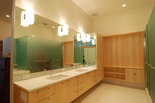
#3 Straighten the vertical perspective lines to be orthogonal. While the eye (and the lens) typically register angled perspective lines they seldom look good in a finished shot. We bend reality with Photoshop’s perspective tool, it can also be accomplished with a perspective correcting lens.
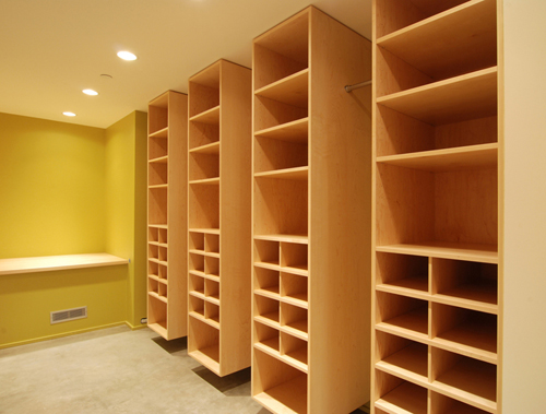
#4 Combine several shots into one. The human eye is able to adjust very quickly to different lighting conditions; from a darkly lit interior to a bright exterior view outside, however the exposure setting of a camera typically captures one or the other. Capturing several photos from the same position with different exposure setting allows for a broader range of light within a single photo. More on HDR photography here.
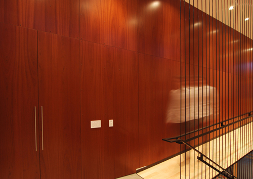
#5 Get some people in the shot. Unless we were showing up to the wrong classes back in school, architecture is made for people most of the time and yet most architectural photography displays the finished product as if built in a vacuum sealed vault far from humanity. The people don’t need to play a major role in the scene or become the personality of the photo, a simple presence is enough. We like to use a slow shutter speed with a moving person so that the shot isn’t taken over by the personality but instead establishes movement and scale.
#6 Direct the viewers attention. While the human eye can rapidly snap everything into focus as you look around the room, we want to focus your attention on key items of the photograph. Keeping the background out of focus is a quick way to direct attention to the cabinets in the foreground.
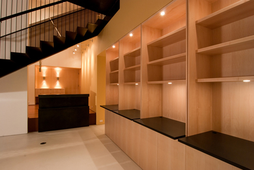
#7 Turn all the lights on. It just looks better and makes the photographers job easier. It’s embarrassing how often we’re mid-way through a photo set and realize that half the lights are still off. Get ‘em all on while you’re staging.
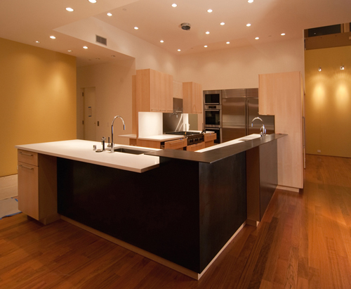
#8 Supplement the scene with artificial light. Even with all the lights on it still may not be enough; large shadow areas can diminish a photo and draw your eye to the black hole. Getting artificial light under desks and cabinets makes for more lively photo and also records more of the architecture. We carry around a halogen light on a tri-pod with a diffuser – it’s mobile and is worth its weight in gold.
#9 Enhance textures. Wood grain that pops out in person can be difficult to pull out in the finished photo. We use a variety of software to enhance the grain after the photo has been taken.
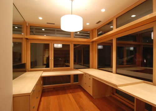
#10 Take lots and lots of photos. You can always weed them down later in the office but you can’t always go back and get more.
We’re always interested in learning new tricks and techniques to produce sharp finished photos – let us know what you’re doing with your photos…
About the cabinet package:
The project includes 1,400 square feet of Brazilian Cherry wall paneling and 6,000 square feet of quarter-sawn maple veneer with quarter-inch edge banding. The sheets are all sequenced for uniformity between adjacent panels. Sugatsune pulls were used with Blum drawer slides and door lifts. The kitchen cabinets are integrated with a steel bar bar others. The architect on the project is E. Cobb Architects and the General Contractor is Flip Builders.


