


In spirit of heading to Manhattan, today’s blog features some sexy diagramming, mapping and visual measures from New York City. These diagrams are stimulating and effective because every graphic move on the paper (or screen) has a meaning; the color, dimension, position, and position relative to other graphics are all important. In addition to all the data, they are composed with craft and intentionality. Let us know what you’ve found out there…
New York Times: In the Shadow of Foreclosures
Both color and height indicate a different measure of foreclosures and the perspective view makes it all the more dramatic. The sharp visual makes a complicated collection of statistics comprehensible and allows for quick visual comparisons.

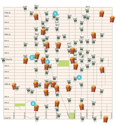
Time Out New York: McDonalds vs. Starbucks
The location of each McDonalds and each Starbucks is mapped in mid-town. The choice of symbols (French fries and coffee cups) effectively adds to the visual of over-propagation.
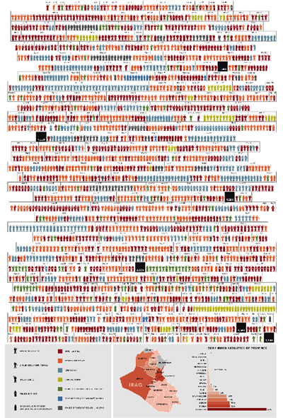
New York Times: A Year in Iraq
The diagram indicates the classification of each individual and how they died, organized as a timeline. The diagram is powerful for the simple fact that each person is represented as a figure in the display.

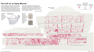
New York Times: Face-Lift for an Aging Museum
A mapping of cracks and movement in the Guggenheim’s concrete shell. While engineering firms commonly make mappings such as this, the artistic enhancements of color and composition allow the technical data to be more interesting and comprehensible.

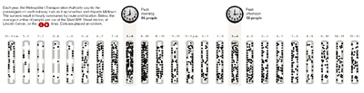
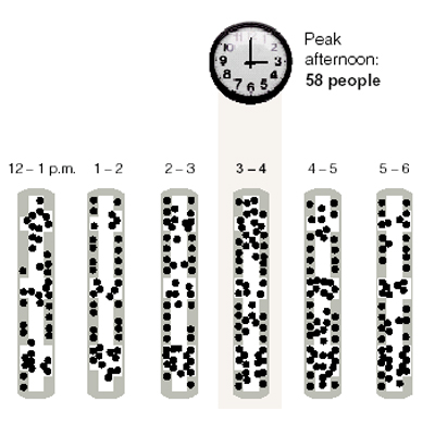
New York Times: Subway Population
…and what would a NYC diagram blog post be without a token subway diagram. This particular diagram tracks the hourly population of the 1/9 subway line over the course of a single work day. The use of ordinary objects, like the clock, make the diagram more tangible and easier on the eyes. Once again representing each individual with an object, or dot in this case, creates a population and drives the idea home more powerfully.
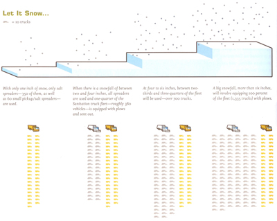
The Works: Anatomy of A City by Kate Ascher
The visual compares the measure of snowfall to the city’s response. As more snow accumulates an increasing amount of garbage trucks are converted to snow plows. This book is filled with great diagrams explaining everything from stoplight calibration for ideal traffic patterns to the city’s storm sewer overflow tactics to the garbage removal sequence. Get a copy here.
New York Times: Inventory of Low Altitude Satellites
The satellites are organized by height above the earth’s surface, color coded by type (military, communication, science) and labeled to the country of ownership. The pixilated nature of the diagram lends to a tangible sense for the number of satellites in space.